Open ten random beauty websites and a pattern emerges almost immediately.
Muted pinks. Soft turquoise. Curvy, elegant fonts that feel more like a signature than a typeface. Furthermore, generous whitespace surrounds every product photo — as if the design itself is giving the skin, the packaging, and the pigment room to breathe.
This is not coincidence. It is a shared visual vocabulary the beauty industry has developed because it works. Furthermore, beauty is an inherently visual, sensory purchase — customers cannot smell a serum or feel a texture through a screen, so the website has to do that emotional work entirely through photography, color, and typography.
The best beauty websites go further than looking clean and sophisticated. Furthermore, they combine that visual language with genuinely smart eCommerce mechanics — clear navigation, strong CTAs, and social proof placed exactly where hesitant buyers need reassurance.
In this guide, we break down 10 of the best beauty websites and the specific lessons each one teaches. Furthermore, whether you sell skincare, makeup, or spa services, these examples give you a clear, applicable direction.
What Makes a Beauty Website Actually Convert?
Before exploring the examples, understand the five factors that separate genuinely high-converting beauty websites from ones that merely look pretty:
| Factor | What It Means |
|---|
| Photography | High-resolution, true-to-color images that build texture and shade confidence. |
| Color Palette | Muted, sophisticated tones that let product imagery carry the visual energy. |
| Navigation | Clear category structure, especially mega menus for large catalogs. |
| Social Proof | Reviews, best-seller badges, and influencer or founder credibility. |
| Checkout Simplicity | Minimal friction between product discovery and completed purchase. |
10 Best Beauty Websites
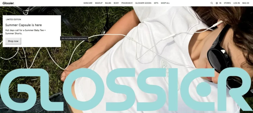
Glossier continues to lead the digital beauty scene with its minimalist aesthetic, intuitive navigation, and strong community-driven branding. In 2025, the brand has doubled down on user-generated content, making reviews and selfies central to the product pages. The site’s pastel color palette, whitespace, and interactive product animations ensure a calming yet effective shopping experience.
Website: fentybeauty.com Founded By: Rihanna Primary Lesson: Vibrant color and image-heavy design can coexist with flawless eCommerce fundamentals
Fenty Beauty built its reputation on genuine inclusivity — covering different skin types and tones broadly and unapologetically. Furthermore, the website matches that mission visually through vibrant colors and an image-heavy design that makes the shade range feel like the star of the show.
Underneath the bold visual identity sits a genuinely well-engineered eCommerce structure. Furthermore, clear navigation lets visitors move between product categories quickly, a mega menu organizes an extensive catalog without overwhelming first-time visitors, and cross-selling tactics appear naturally throughout the browsing journey. Consequently, Fenty Beauty proves that visual boldness and conversion discipline are not mutually exclusive.
Key Design Lessons:
✅ Bold, vibrant color schemes work when eCommerce fundamentals remain flawless underneath
✅ Mega menus are essential for large, diverse product catalogs
✅ Cross-selling should feel like natural discovery, not aggressive upselling
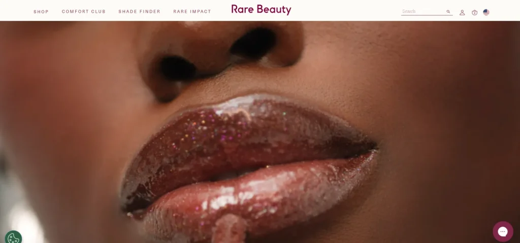
Rare Beauty, by Selena Gomez, uses storytelling and authenticity to connect with users. The site features emotional content, real customer testimonials, and behind-the-scenes videos to build trust. The overall experience feels personal and empowering, which aligns with the brand’s mission of mental wellness.
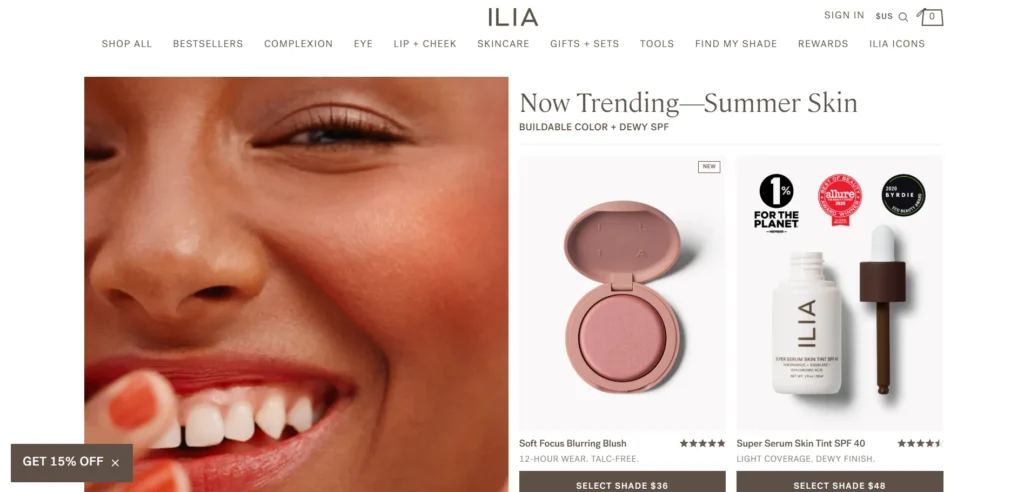
Ilia Beauty combines clean beauty with sleek design. The site highlights sustainable practices and ingredients, appealing to eco-conscious shoppers. Interactive elements like ingredient transparency pop-ups and sustainability impact counters make this site stand out in 2025.
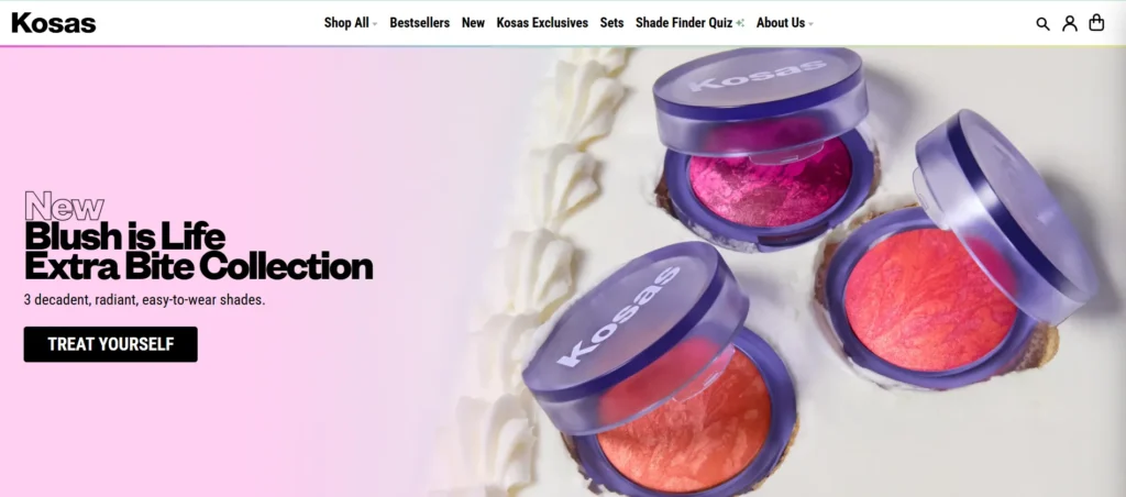
Kosas is known for bold colors and clean formulations. The website leverages bright hues and playful animations to reflect its youthful energy. Their product pages include before-and-after images, tutorials, and texture videos, helping customers make informed choices.
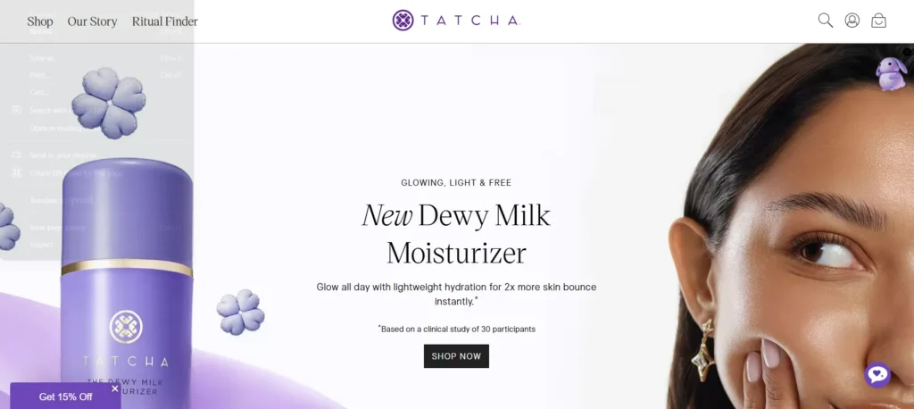
Tatcha blends Japanese beauty traditions with modern digital experiences. The site is elegant, with gold accents, cultural storytelling, and graceful motion effects. Their blog-style education hub, “The Essence,” offers tips, rituals, and ingredient knowledge, supporting SEO and customer trust.
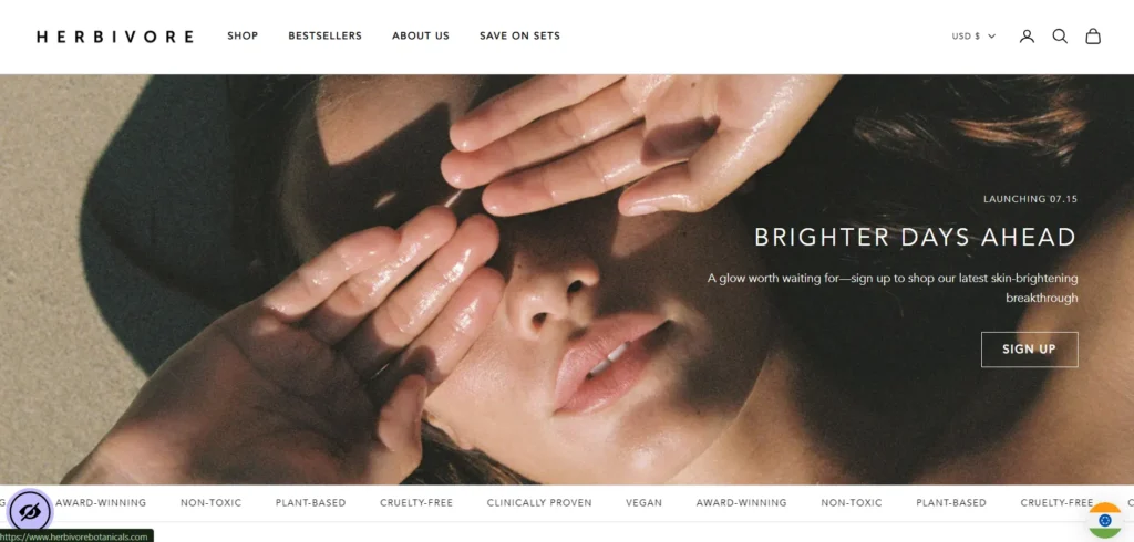
This brand focuses on raw, minimal skincare. The website reflects a calming, natural vibe with earthy tones and soft photography. Herbivore’s site excels in showing product benefits through microcopy and visual storytelling, making it perfect for mindful shoppers.
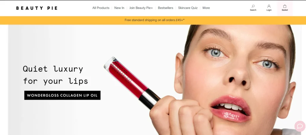
Beauty Pie disrupts the traditional luxury beauty model by offering high-quality products at transparent pricing through a membership-based model. Their website reflects this modern approach with a clean, editorial-style layout that feels like a premium beauty magazine. It offers in-depth product pages, smart bundling options, and value comparisons that educate the customer.
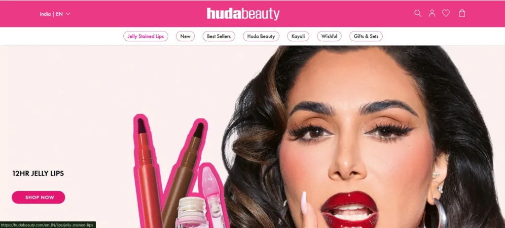
Huda Beauty’s website continues to dominate in 2025 with its high-energy, glam-driven design. The site uses large product visuals, bold typography, and influencer-led video content to keep visitors engaged. With an integrated blog, tutorials, and direct links to trending products, it perfectly blends content and commerce.
Typology Paris is a rising star in the clean beauty scene, known for its minimalist design, transparency, and ingredient-first approach. The 2025 version of their website is a masterclass in elegant simplicity. It focuses heavily on education—offering ingredient glossaries, detailed usage guides, and skin diagnostic tools. The site’s monochrome palette, generous spacing, and editorial photography give it a refined, almost pharmaceutical feel, while still being approachable.
5 Design Principles Every Beauty Website Should Follow
1. Photography Investment Delivers the Highest Return
Every website in this guide treats photography as foundational rather than decorative. Furthermore, true-to-color, high-resolution imagery builds the shade and texture confidence that beauty customers need before purchasing something they cannot physically touch. Consequently, photography deserves the largest share of any beauty website’s design budget.
2. Muted Palettes Let Products Provide the Color
The most consistent visual pattern across successful beauty websites is restraint in background and interface color. Furthermore, muted pinks, soft neutrals, and turquoise accents create a canvas that lets vibrant product packaging and pigments become the visual focal point rather than competing with a loud brand palette.
3. Navigation Must Scale With Catalog Size
Sephora and Fenty Beauty both prove that even extensive catalogs remain navigable with the right mega menu and filtering structure. Furthermore, a visitor who cannot find their shade, skin type, or category quickly leaves regardless of how beautiful the homepage looked. Consequently, navigation investment should scale directly with product range complexity.
4. Social Proof and Mission Content Convert Best When Integrated
Thrive Causemetics and Credo both demonstrate that values-driven and educational content converts most effectively woven throughout the browsing journey rather than isolated on a separate page. Furthermore, reviews, best-seller badges, and mission messaging should appear at the exact moments purchase hesitation is highest.
5. Page Speed Protects Every Visual Investment
Beauty websites are naturally image-heavy, making them particularly vulnerable to slow loading. Furthermore, a stunning product photograph that takes six seconds to appear loses the visitor before they ever see it. Consequently, image optimization and quality hosting are not optional extras for a beauty brand — they are what makes every other design decision actually visible.
Building a Beauty Website on WordPress
While many brands featured in this guide use Shopify, WordPress with WooCommerce remains a genuinely strong option for beauty brands wanting deeper content integration alongside their store.
Essential WordPress tools for beauty websites:
- Theme: Astra or Kadence — lightweight, clean foundations for photography-heavy layouts
- Page Builder: Elementor Pro — visual control for magazine-style product storytelling
- eCommerce: WooCommerce — complete product, shade-variant, and checkout functionality
- Performance: WP Rocket — essential given the image density beauty sites require
- SEO: Rank Math — optimizes product and educational content for organic search
Moreover, WordPress ownership means your photography, brand education content, and customer data remain permanently yours — an advantage for beauty brands building long-term editorial and community trust alongside their store.
5 Common Beauty Website Mistakes That Cost Sales
Knowing what works matters. Furthermore, knowing what actively drives customers away matters just as much — because even one of these mistakes can undo the trust that strong photography and smart navigation worked hard to build.
Mistake 1: Inconsistent Color Representation
Nothing damages beauty eCommerce trust faster than a product arriving in a shade that looks nothing like the website photo. Furthermore, inconsistent lighting, poor color calibration, and over-edited product images create the exact mismatch that drives returns and one-star reviews. Consequently, investing in true-to-life photography with consistent lighting setups across the entire catalog protects both customer trust and your return rate simultaneously.
Mistake 2: Missing Shade or Skin-Type Guidance
Beauty purchases carry a specific anxiety that most other product categories do not — will this actually work for me? Furthermore, websites that list products without shade-matching tools, skin-type filters, or detailed undertone descriptions leave visitors to guess. Moreover, that uncertainty is exactly what pushes hesitant shoppers toward abandoning their cart rather than risking a wrong purchase. Consequently, even simple additions like a shade-finder quiz or clear undertone labeling meaningfully reduce this specific friction point.
Mistake 3: Burying Ingredient Information
Modern beauty customers, particularly in clean and green beauty categories, actively research ingredients before purchasing. Furthermore, forcing visitors to hunt for ingredient lists or safety information signals either carelessness or something to hide. Consequently, surfacing ingredient transparency directly on the product page — not in a hard-to-find PDF or footer link — builds exactly the trust that Credo and similar brands have demonstrated works.
Mistake 4: Overwhelming First-Time Visitors With Choice
Large catalogs are a genuine strength, but only when navigation keeps pace. Furthermore, a first-time visitor facing hundreds of unfiltered products without clear starting points — best-sellers, quizzes, or curated collections — often leaves overwhelmed rather than excited. Moreover, Soko Glam’s curated approach and 100% Pure’s “Most Reviewed” section both solve this by giving new visitors an obvious, low-risk entry point rather than an undifferentiated wall of products.
Mistake 5: Neglecting Mobile Shade and Texture Viewing
A significant majority of beauty shopping now happens on mobile screens, often in short browsing sessions during commutes or breaks. Furthermore, product images that were carefully composed for desktop sometimes crop poorly or lose critical texture and shade detail on smaller screens. Consequently, testing every product gallery specifically on mobile — not just confirming the page loads, but confirming shade and texture remain genuinely visible — protects the exact visual confidence-building work photography is meant to achieve.
Conclusion
The ten beauty websites in this guide succeed because they understand something fundamental about the category — customers are not just buying a product, they are buying confidence that the product will work for them specifically.
Furthermore, every one of these approaches is achievable regardless of your brand’s size — the underlying principles of strong photography, restrained color, scalable navigation, integrated social proof, and fast performance apply whether you sell three products or three thousand.
Therefore, study which of these ten approaches aligns most closely with your specific beauty brand and audience. Consequently, your website becomes more than a store — it becomes the confidence-building experience that turns curious browsers into loyal customers.
Frequently Asked Questions (FAQs)