Introduction
Most people building a WordPress website make the same mistake.
They open a blank page builder, scroll through templates, pick something that “looks nice,” and hope for the best. Furthermore, they wonder later why their site does not attract visitors or convert them into customers.
The smarter approach? Study websites that already work.
WordPress powers more than 43% of all websites on the internet. That includes some of the most visited, most trusted, and most profitable websites in the world. Furthermore, every successful WordPress website follows specific design principles that make it fast, engaging, and effective.
In this guide, we break down 25 of the best WordPress website examples across 5 major categories. Moreover, we explain exactly what each site does well and how you can apply those lessons directly to your own project.
What Makes a Great WordPress Website?
Before exploring the examples, understand what separates good WordPress websites from truly great ones. We evaluated every website across four key factors:
| Factor |
What We Look For |
| Design |
Visual appeal, color scheme, typography, and layout |
| Usability |
Navigation, CTAs, and logical page flow |
| Responsiveness |
Mobile, tablet, and desktop experience |
| Performance |
Page speed, image optimization, and Core Web Vitals |
Keep these four factors in mind as you explore each example below.
Business WordPress Website Examples
Business websites must do one thing above all else — build trust fast. Furthermore, they need to communicate value clearly and guide visitors toward a specific action.
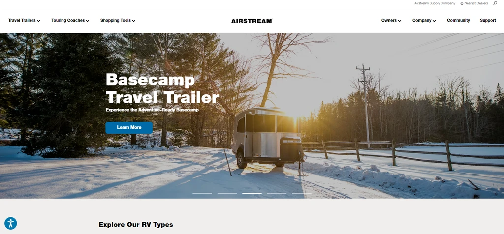
Airstream’s WordPress homepage uses cinematic product photography as its primary design element. Large images of their iconic travel trailers occupy most of the landing page. Furthermore, bold headlines and clear CTAs guide visitors immediately toward exploring models or contacting dealers.
- Lead with your product visually — quality speaks before text does
- Minimalist layouts reduce distraction and focus visitor attention
- Place your primary CTA above the fold where every visitor sees it
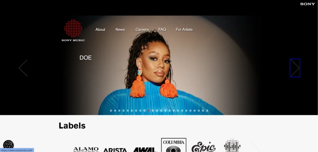
Sony Music’s WordPress site prioritizes branding over complexity. A consistent black, white, and red color scheme matches the company’s global identity perfectly. Furthermore, homepage space showcases featured artists and releases — communicating prestige and scale immediately.
- Consistent brand colors build instant recognition across every page
- Feature your most credible clients or projects prominently on the homepage
- Keep navigation simple — visitors should find anything within two clicks
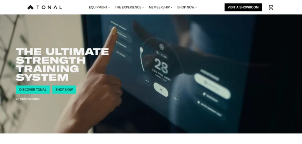
Tonal sells smart home gym equipment. Their WordPress site uses video backgrounds and motion elements to demonstrate the product in action. Furthermore, media reviews and brand ambassador features appear on the homepage to build credibility before visitors see a price.
- Video is powerful for products that need demonstration
- Social proof from recognized sources converts skeptical visitors
- Sophisticated design signals premium product quality

TeamViewer’s WordPress homepage prioritizes conversion over aesthetics. Every element serves a purpose — a phone number, live chat, talk-to-sales button, and TrustPilot reviews all appear on the landing page. Furthermore, visitors have multiple clear paths to purchase.
- Multiple contact options reduce friction for different visitor types
- Third-party review integration builds trust without self-promotion
- Every element should earn its place by supporting conversion
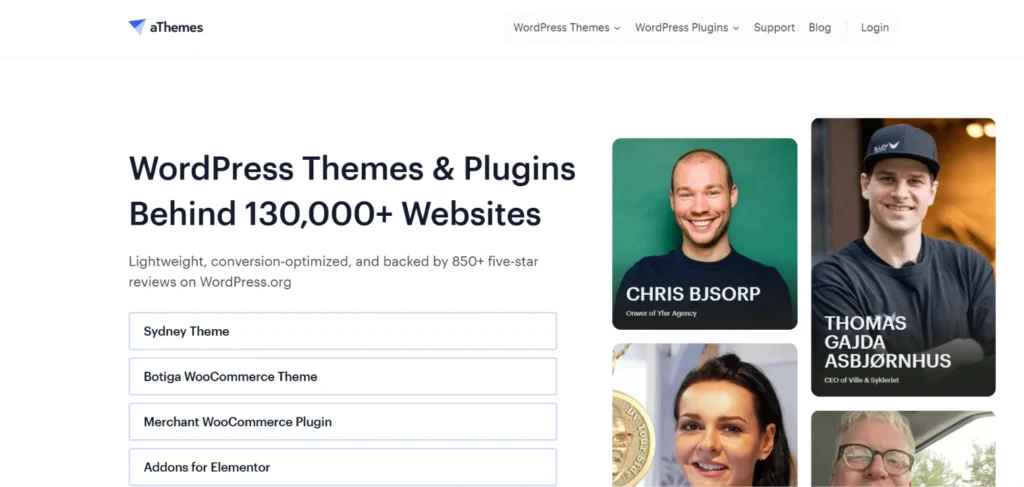
aThemes leads with a clear value proposition. Large text explains exactly what the product does. Furthermore, prominent CTA buttons appear before visitors need to scroll. Consequently, visitors understand the offer and can act within seconds of arrival.
- Value propositions should be instantly clear — no jargon, no confusion
- CTA buttons above the fold capture high-intent visitors immediately
- Simplicity often outperforms visual complexity for business websites
eCommerce WordPress Website Examples
WooCommerce turns WordPress into a full-featured online store. Furthermore, the eCommerce examples below show the range of what WordPress handles — from handmade jewelry to global fashion brands.
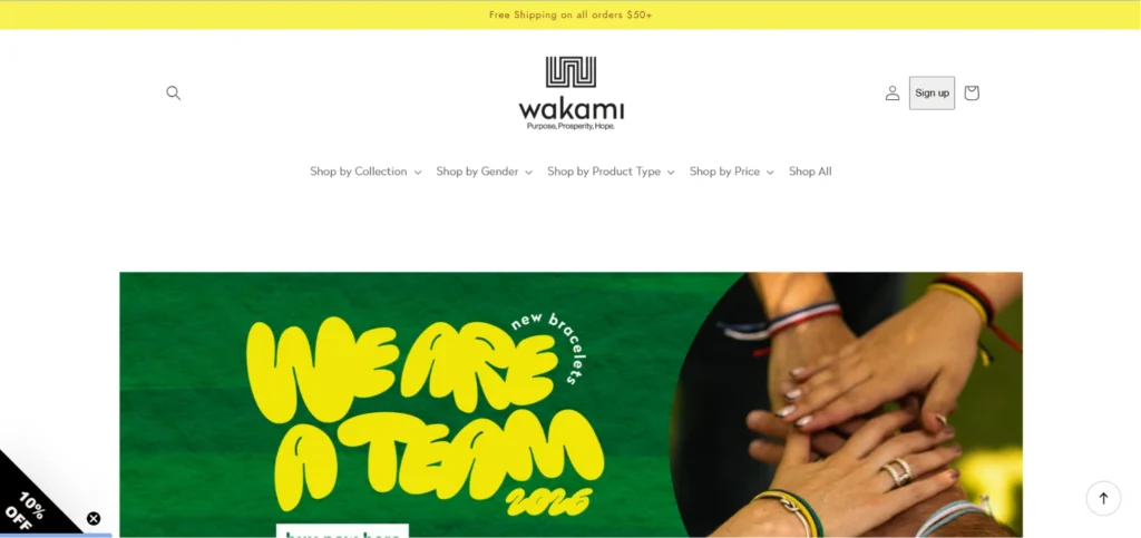
Wakami sells handmade Guatemalan bracelets. Their WooCommerce store uses warm, vibrant colors reflecting their cultural heritage. Furthermore, storytelling about artisan communities builds emotional connection before visitors view a single product.
- Brand story creates emotional investment before purchase decisions
- Color palette should reflect product personality and brand identity
- Ethical sourcing content converts value-conscious shoppers effectively
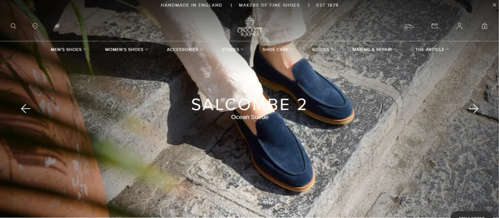
This heritage British shoemaker uses WooCommerce to sell premium footwear globally. Restrained, sophisticated design matches their luxury positioning. Furthermore, detailed craftsmanship photography justifies premium pricing before customers reach the price tag.
- Product photography quality directly impacts conversion rates
- Luxury brands should use restraint — visual clutter undermines premium positioning
- Detailed product descriptions build confidence for high-value purchases
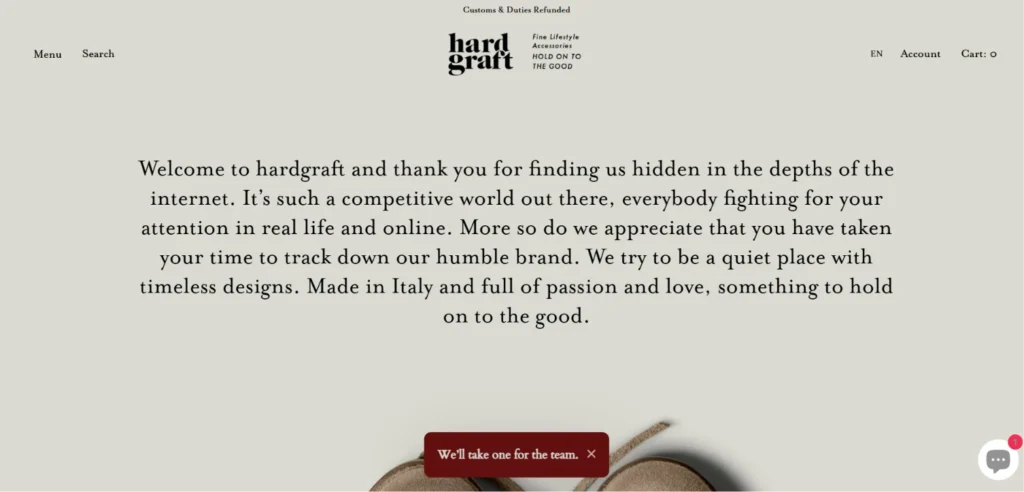
Hardgraft sells handcrafted leather accessories. Their WooCommerce store uses editorial-style photography and minimal text to create a premium brand experience. Furthermore, lifestyle images show products in real-world context rather than against plain backgrounds.
- Lifestyle photography creates desire more effectively than plain product shots
- Every word on a minimal site carries extra weight — choose carefully
- White space is not wasted space — it elevates perceived product quality
A luxury French skincare brand using WooCommerce for global sales. Elegant typography, soft color palettes, and ingredient-focused content position the brand in the premium beauty segment. Moreover, detailed ingredient explanations build scientific credibility alongside aesthetic appeal.
- Premium beauty brands need both emotional and rational content
- Typography communicates brand personality before any other design element
- Ingredient transparency builds trust in health and beauty categories
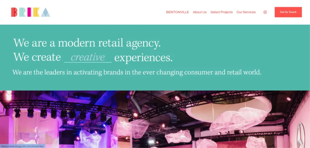
Brika is a curated online marketplace for handcrafted goods. Their WooCommerce store uses a clean grid layout with consistent product photography standards. Furthermore, maker stories alongside each product add a personal dimension that mass-market retailers cannot replicate.
- Consistent product photography creates a premium marketplace feel
- Maker or founder stories differentiate independent stores from large retailers
- Clean grid layouts make product browsing intuitive and enjoyable
Blog and Content WordPress Website Examples
WordPress began as a blogging platform — and its content management capabilities remain best-in-class. Furthermore, the blog examples below show how content-first design drives both reader engagement and search engine visibility.
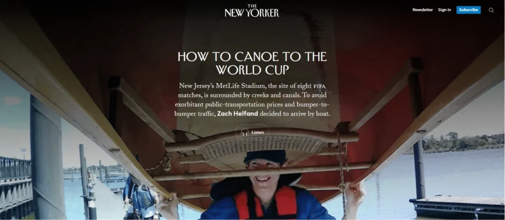
One of the world’s most respected publications runs on WordPress. Their site prioritizes readability above everything else. Furthermore, clear typographic hierarchy, generous white space, and clean category navigation make long-form content enjoyable across all devices.
- Typography is the most important design element for content-heavy websites
- White space increases perceived content quality significantly
- Category navigation should reflect how readers think, not how editors categorize
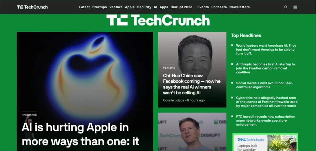
TechCrunch publishes breaking technology news on a fast-loading, highly organized WordPress site. Furthermore, their homepage balances news urgency with organized category browsing. Consequently, both casual readers and regular visitors find what they need without friction.
- News sites need recency signals and organized content pathways simultaneously
- Fast loading is non-negotiable when content freshness drives traffic
- Mobile reading experience deserves equal investment to desktop
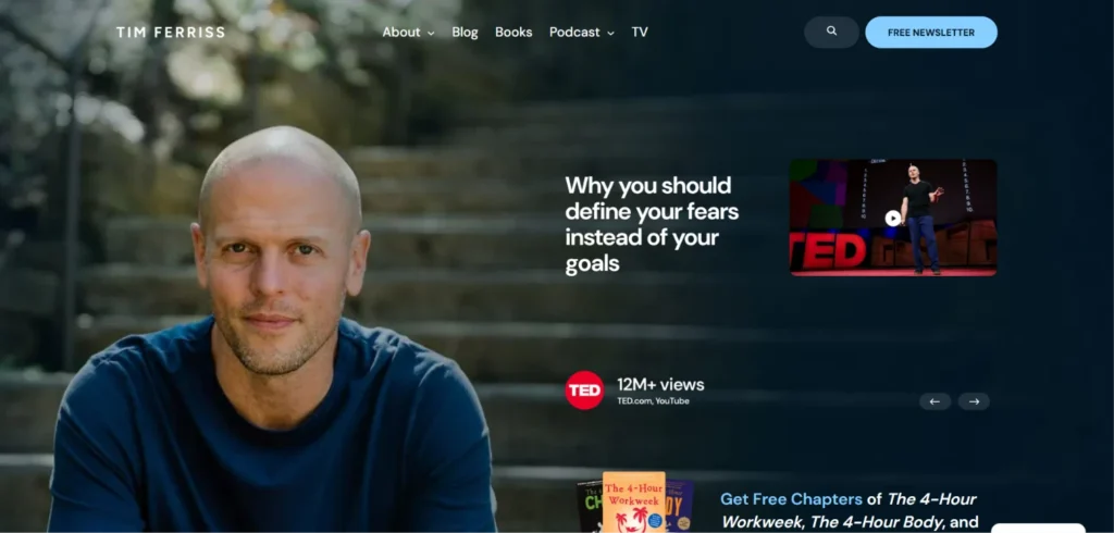
The Tim Ferriss website demonstrates how personal brand content platforms should work. Content takes center stage. Navigation stays minimal. Furthermore, popular posts, podcast episodes, and book recommendations are all discoverable from the homepage without clutter.
- Content-first design keeps readers focused on the actual value you provide
- Cross-content linking between different formats extends session depth
- Personal brand sites need a clear voice visitors recognize immediately
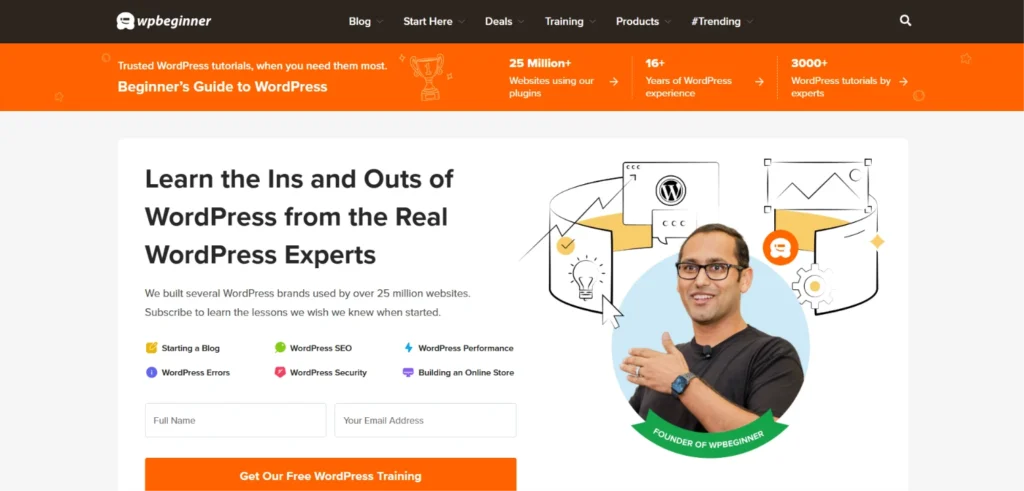
WPBeginner is one of the most successful WordPress tutorial sites online. Their design prioritizes trust signals — author credentials, post dates, and clear category organization. Furthermore, strong internal linking between related tutorials creates a resource web that keeps visitors exploring.
- Tutorial sites need strong internal linking to maximize session time
- Trust signals on educational content improve return visit rates
- Search-optimized category structure captures long-tail keyword traffic
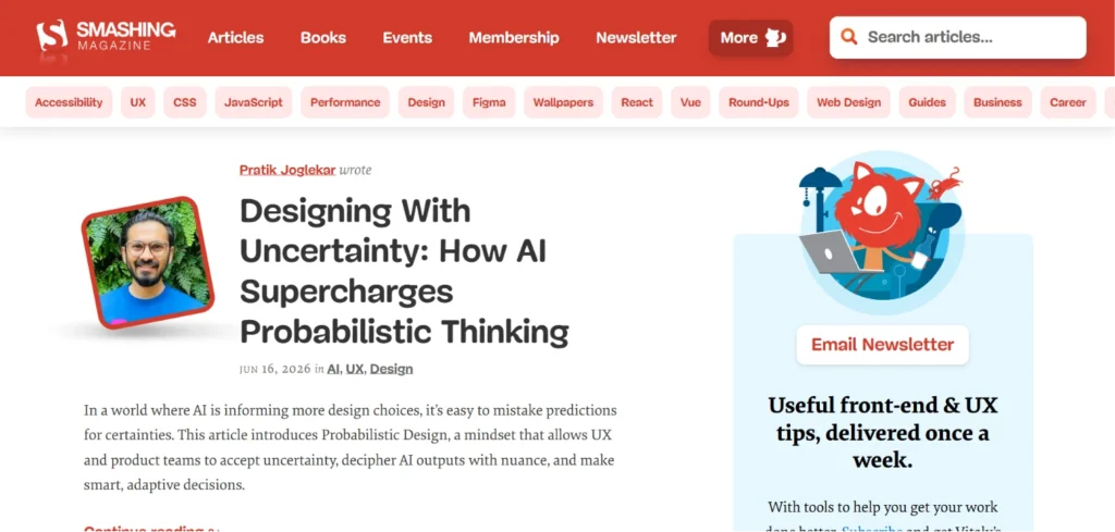
Smashing Magazine serves web designers and developers with dense, technical content delivered through a clean WordPress design. Furthermore, paid membership integration, article bookmarking, and newsletter signup add engagement layers beyond standard blog functionality.
- Paid membership models work well on WordPress with the right plugin combination
- Technical audiences appreciate information density — avoid oversimplifying
- Multiple engagement layers reduce the chance visitors leave without connecting
Creative and Agency WordPress Website Examples
Creative agencies and portfolio sites use WordPress to showcase work, attract clients, and demonstrate the exact capabilities they sell. Furthermore, these sites often push WordPress design boundaries — showing what the platform achieves with skilled implementation.
Pentagram is one of the world’s most respected design agencies. Their WordPress site uses a bold, full-width grid of project thumbnails as the primary navigation experience. Furthermore, project pages let work speak for itself with minimal surrounding interface.
- Creative agencies should let their work function as the primary interface
- Full-width visual grids communicate scale and confidence simultaneously
- Minimal navigation chrome keeps focus entirely on portfolio content
Hello Monday is a digital design and experience studio. Their WordPress site uses interactive elements, motion design, and unconventional layouts to showcase creative capability. Furthermore, the site itself functions as a live case study — every visitor interaction demonstrates what the agency builds for clients.
- Agency websites are portfolio pieces — every interaction is a demonstration
- Motion and interaction communicate creative capability more effectively than text
- Unconventional layouts differentiate creative agencies from generic competitors
Canadian digital agency Locomotive uses WordPress to showcase scroll-based animations and immersive project presentations. Furthermore, subtle hover effects and smooth transitions demonstrate technical craft without overwhelming the underlying content.
- Scroll-based animation adds engagement without sacrificing performance when done well
- Hover states reward exploration and extend time on site
- Technical showcase sites should load fast despite visual complexity
Vogue’s WordPress site is a masterclass in editorial visual design at scale. High-impact photography, elegant typography, and seamless mobile experience create a luxury reading environment. Furthermore, content categorization by fashion, beauty, culture, and celebrity serves distinct reader segments without creating navigation complexity.
- Image quality sets the ceiling for perceived content quality on any site
- Editorial typography should feel like an extension of brand identity
- Category-based navigation serves returning readers better than algorithmic feeds
Mozilla’s blog demonstrates clean, community-focused content publishing at scale. The design prioritizes readability and content discovery. Furthermore, clear author attribution, topic tagging, and accessible design reflect Mozilla’s open-source values through every visual choice.
- Design choices communicate organizational values before any content does
- Author attribution builds reader relationships on content-heavy sites
- Accessible design serves more users and earns stronger search rankings simultaneously
News and Magazine WordPress Website Examples
News and magazine websites demand WordPress performance at scale. Furthermore, these sites publish hundreds of articles daily while maintaining fast load times and organized content discovery for returning visitors.
BBC America’s WordPress site handles high traffic volumes reliably. The homepage uses a clear editorial grid with strong hero images and clean typographic hierarchy. Furthermore, show-specific sections create distinct content zones that regular visitors navigate directly.
- Editorial grids organize large content volumes without overwhelming visitors
- Section-based navigation serves returning visitors better than generic menus
- Strong hero images drive click-through on featured content significantly
Entertainment publication Variety balances breaking news urgency with organized content browsing on WordPress. Furthermore, related article sections and trending content widgets extend session depth effectively. Consequently, readers discover more content than they originally searched for.
- Ad placement requires careful balance to avoid degrading the reading experience
- Trending content widgets capture recency-seeking reader behavior effectively
- Mobile reading experience needs specific optimization for text-heavy publications
TIME’s WordPress site demonstrates how a historic print brand transitions successfully to digital. Clean layouts, strong photography, and clear section navigation serve readers across every device. Furthermore, subscriber content and newsletter integration add multiple engagement layers.
- Legacy media brands need digital-native experiences, not digitized print layouts
- Video integration increases session time on news sites significantly
- Clear subscriber value proposition converts regular readers into paying members
The official government website runs on WordPress and serves millions of visitors daily with policy documents, press releases, and public resources. Furthermore, accessibility compliance, fast loading, and clear navigation serve an extraordinarily diverse user base effectively.
- Accessibility is not optional — it serves more users than most website owners realize
- WordPress handles mission-critical government-level traffic reliably
- Clear information hierarchy removes the need for search on most pages
Disney’s corporate WordPress site manages investor relations, press information, and brand communications. The design uses restrained corporate aesthetics with subtle brand personality. Furthermore, clear audience segmentation — investors, media, job seekers — ensures every visitor finds their relevant section immediately.
- Corporate sites benefit from clear audience segmentation in navigation
- Restrained design does not mean boring — subtle brand elements maintain personality
- Investor and press sections need fast, clean access to documents and contacts
Why Make a WordPress Website
Many platforms let you build a website today. Wix, Squarespace, Joomla, and dozens of others all compete for your attention. Furthermore, each one promises simplicity and professional results.
So why do millions of people still choose WordPress over every alternative?
Because WordPress consistently delivers what other platforms cannot — real flexibility, long-term ownership, and a community that never leaves you stuck.
Here is what makes WordPress stand apart from every competitor:
Active Community — WordPress is the most widely used CMS on the internet. Consequently, a massive global community of developers, designers, and everyday users surrounds it. Moreover, whenever you face a problem, forums, tutorials, and documentation already have your answer waiting.
Flexibility — WordPress offers thousands of themes and plugins that handle virtually any website need. Furthermore, you can customize design, functionality, and user experience as deeply as you want — from simple visual changes to advanced custom code. Consequently, no two WordPress websites need to look or work the same way.
Scalability — WordPress grows with your business. Start with a simple 3-page site and scale to thousands of products, users, or articles without switching platforms. Moreover, upgrading your hosting plan handles increased traffic without rebuilding anything from scratch.
Fast and Reliable — WordPress gives you direct control over your website’s performance. Install a caching plugin, choose a lightweight theme, optimize your images, and connect a CDN. Consequently, a well-optimized WordPress site loads faster than most website builder alternatives.
Additional Read
Conclusion
Great web design is not about the biggest budget or the most advanced technical skills. It is about understanding your audience, organizing content thoughtfully, maintaining visual consistency, and optimizing for performance relentlessly.
Furthermore, every principle these 25 sites demonstrate is available to any WordPress website builder — regardless of experience level or budget. Therefore, do not just read these examples. Apply their lessons to your own project.
Study Airstream for product-led homepage design. Learn from NASA how to organize complex content. Follow Vogue’s lead on visual consistency. Apply Tim Ferriss’s content-first approach. Adopt Mozilla Blog’s commitment to clean, trustworthy typography.
Moreover, every lesson applies whether you are building a business website, personal blog, e-commerce store, or creative portfolio. Consequently, the design principles that make these 25 sites work will make your WordPress website better — starting today.
Frequently Asked Questions (FAQs)