

Yet that is exactly what a finance website asks visitors to do — trust an unfamiliar brand with something more personal than almost any other purchase decision. Furthermore, before a visitor ever opens an account, invests a rupee, or books a consultation, your website has already made the case for whether you are trustworthy, competent, and secure.
In the current financial landscape, a finance website is no longer just a digital brochure. It is foundational architecture for trust and security. Furthermore, fintech innovators, wealth managers, and institutional banks all face the same design challenge — projecting rock-solid stability while delivering a frictionless, human-centric experience. Consequently, the best finance websites move beyond sterile corporate templates and embrace what design experts call “Transparent Performance” — real-time data, clear fee structures, and visible security signals that eliminate skepticism before a single conversation happens.
In this guide, we analyse 10 of the best finance website designs. Furthermore, each example demonstrates specific lessons you can apply to your own financial services website — whether you run a fintech startup, a wealth advisory firm, or a traditional financial institution moving online.
Building your finance website on WordPress? Read: How to Start a WordPress Website Step by Step
What Makes a Finance Website Trustworthy?
Before exploring the examples, understand the five factors that separate finance websites people trust from those they abandon:
| Factor | What It Means |
|---|---|
| Security Signals | SSL, compliance badges, and bank-grade messaging visible immediately to build trust. |
| Fee Transparency | Clear pricing and cost structures with no hidden surprises. |
| Data Visualization | Real-time charts and performance data that enhance credibility. |
| Human Touch | Thoughtful design elements and messaging that make a naturally serious industry feel approachable. |
| Navigation Clarity | Well-organized categories that efficiently guide different types of visitors. |
9 Best Finance Designs to Checkout
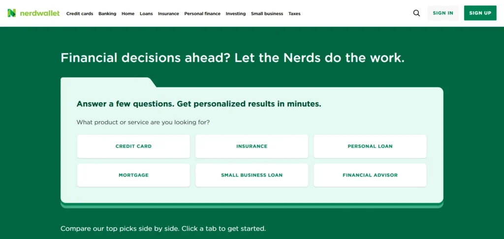
NerdWallet continues to dominate in 2025 as one of the most reliable and user-friendly personal finance websites. With its clean UI, interactive tools, and helpful comparison charts, it empowers users to make smarter financial decisions. The use of well-structured blog content, SEO-rich reviews, and calculators makes it a go-to resource for credit cards, mortgages, and investing.
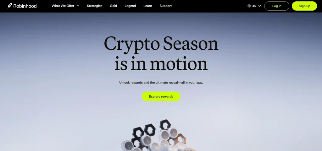
Robinhood’s website offers an excellent blend of modern design and powerful fintech features. It uses strong visual hierarchy, compelling CTAs, and seamless mobile integration. The homepage delivers clarity about investing, crypto, and retirement in a single scroll, making the platform accessible even to first-time investors.
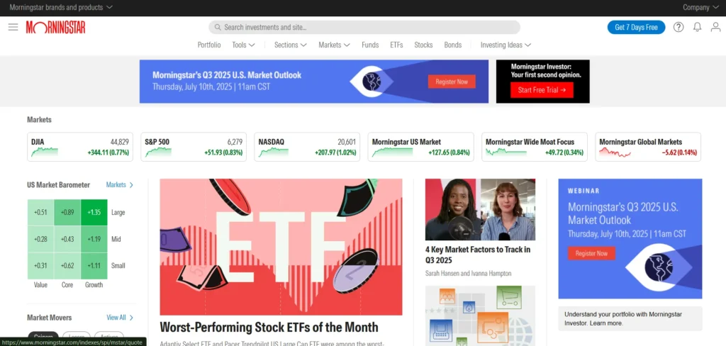
Morningstar excels with its in-depth analytics and professional-grade investment research. The site is designed for both amateur and professional investors. In 2025, their enhanced data dashboards and AI-driven recommendations stand out. The structured data presentation with customizable reports makes it a powerful platform for finance professionals.
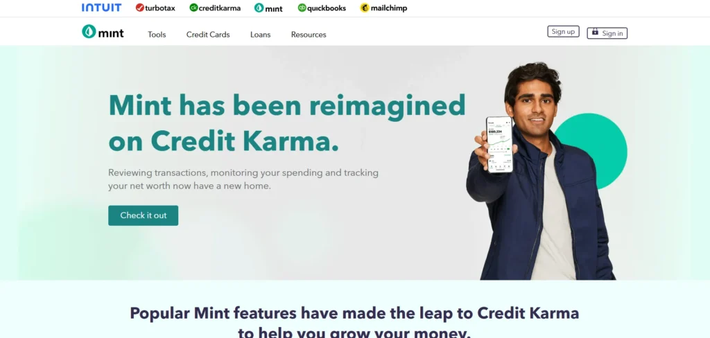
Mint remains a favorite for personal budgeting and financial tracking. With simple account syncing and powerful data visualization tools, the site delivers real-time insights into your finances. The UI focuses on clarity and ease of use, making budgeting stress-free for users of all skill levels.
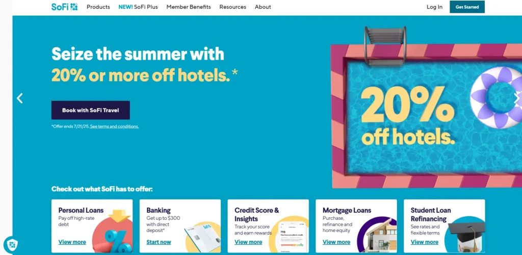
SoFi continues to evolve as a comprehensive financial ecosystem. From student loans to investing and insurance, the site’s modern and minimalist interface is backed by rich educational resources. Their homepage smartly funnels visitors into product categories with bold CTAs and crisp navigation.
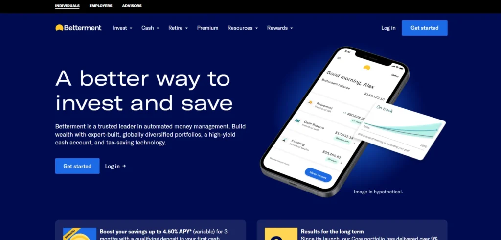
Betterment is leading in robo-advisory with a user-centric web design that simplifies investment decisions. Their 2025 website emphasizes trust through testimonials, secure integrations, and transparent fee breakdowns. The onboarding experience is interactive and highly tailored.
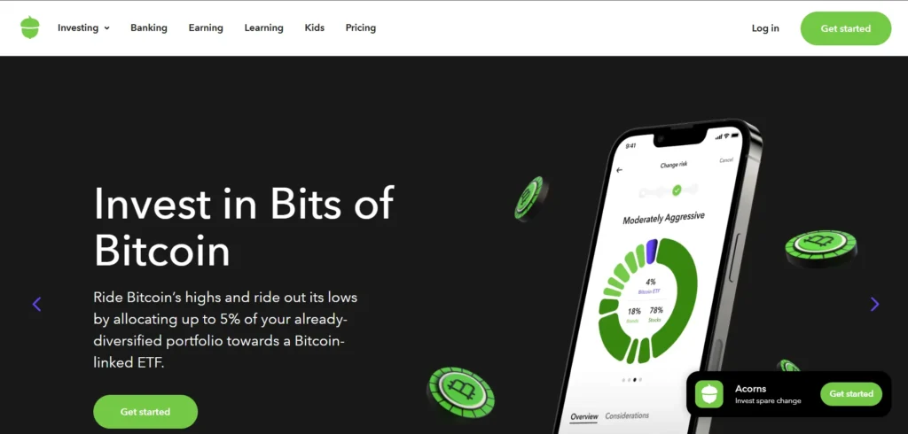
Acorns focuses on micro-investing with a clean and vibrant website design aimed at younger audiences. The storytelling approach and use of animations on scroll help demystify investing. Their educational content, blog, and tools are seamlessly integrated with a slick UX.
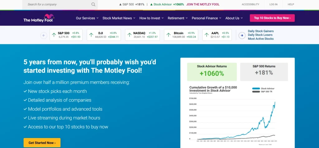
The Motley Fool remains a giant in financial education and stock recommendations. Their homepage in 2025 is content-rich, yet well-organized, featuring top picks, newsletters, and premium insights. The consistent use of trust signals and social proof boosts user confidence.
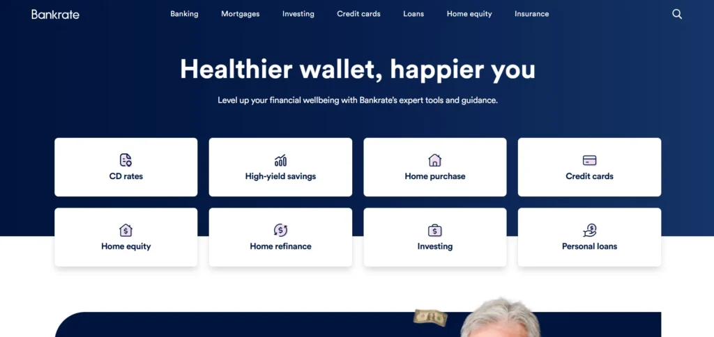
Bankrate provides authoritative financial product comparisons—from mortgage rates to auto loans. The site uses clear typography, simple calculators, and expert-backed content. In 2025, it’s still a gold standard for SEO-driven finance content and monetization via affiliate partnerships.
5 Design Principles Every Finance Website Needs
1. Security Signals Must Be Visible, Not Buried
Visitors evaluating a financial services website look for reassurance immediately — SSL padlocks, compliance badges, and security language should appear where visitors actually look, not buried on a separate security page. Furthermore, in an industry where digital safety is the ultimate luxury, hiding your security credentials wastes their trust-building power entirely.
SSL is the foundation of every trustworthy financial website. Read: Do You Need SSL for Your WordPress Website?
2. Fee Transparency Eliminates Skepticism
Vague or hidden fee structures create the exact skepticism that finance websites need to overcome. Furthermore, clearly presented costs — even when the numbers are not the lowest in the market — build more trust than opaque pricing that visitors suspect hides unpleasant surprises.
3. Data Visualization Builds Credibility Faster Than Text
Real-time charts, performance graphs, and visual data representations communicate credibility in seconds that paragraphs of text would take minutes to establish. Furthermore, visitors evaluating investment or banking platforms specifically look for evidence of performance — not promises about performance.
4. Human Touches Soften a Naturally Serious Industry
Finance is inherently serious, and websites that feel entirely cold and corporate struggle to build the personal trust that financial decisions require. Furthermore, live chat, approachable photography, and warm micro-copy all help humanize an industry that can otherwise feel intimidating to average consumers.
5. Speed and Mobile Performance Are Trust Signals Too
A slow-loading finance website subtly signals unreliability — if the site cannot load quickly, why would visitors trust it with their money? Furthermore, mobile banking and investment checking happen constantly throughout the day, making mobile performance directly tied to daily user trust and satisfaction.
Performance optimization applies to every serious website. Read: 12 Best Speed Optimization Tips for Your WooCommerce Store
Building Your Finance Website on WordPress
WordPress provides a strong, flexible foundation for finance and fintech websites of every size. Furthermore, premium finance-focused themes and a mature plugin ecosystem let financial services companies build trust-forward, secure websites without enterprise development costs.
Essential WordPress tools for finance websites:
- Theme: Purpose-built finance themes (Financity, WealthCo, FinFlow) or lightweight general themes like Astra
- Security: Wordfence — critical for websites handling sensitive financial data
- SSL: Non-negotiable — free through most quality hosting providers
- Performance: WP Rocket — fast loading builds trust and improves search rankings
- SEO: Rank Math — technical SEO for competitive financial keywords
- Forms: WPForms with encrypted field support for sensitive client information
Moreover, WordPress ownership means your compliance documentation, client data policies, and security configurations remain fully under your control — an important consideration for regulated financial services businesses.
Understand your complete website investment. Read: WordPress Website Cost: An Actual WordPress Price
6 Common Finance Website Mistakes That Destroy Trust
Understanding what works matters. Furthermore, understanding what actively damages trust matters just as much — because a single mistake can undo everything ten good design decisions achieved.
Mistake 1: Burying Security Certifications
Many finance websites hold genuine security certifications — SOC 2, PCI DSS, ISO 27001 — yet display them only in a footer link nobody clicks. Furthermore, if a visitor has to search for proof of your security standards, that proof loses almost all its trust-building power. Consequently, security certifications deserve placement near your primary call-to-action, not buried three clicks deep.
Mistake 2: Using Stock Photography of "Happy Bankers"
Generic stock images of smiling people in suits shaking hands have become a visual cliché that signals inauthenticity rather than professionalism. Furthermore, visitors have seen this exact photography style across hundreds of competing financial websites. Moreover, authentic photography — your actual team, your actual office, your actual product interface — builds far more credibility than polished stock alternatives. Consequently, replacing generic stock imagery is often the single highest-impact, lowest-cost improvement a finance website can make.
Mistake 3: Overcomplicating the Account Opening Process
Every additional form field between a visitor’s decision to sign up and their completed application increases abandonment. Furthermore, finance websites frequently ask for information upfront that could be collected later in the relationship — creating unnecessary friction at the exact moment conversion matters most. Consequently, auditing your onboarding flow specifically for unnecessary steps often recovers meaningful conversion volume without any visual redesign at all.
Mistake 4: Hiding Fees Until the Final Step
Nothing damages financial trust faster than a visitor discovering unexpected costs only after investing significant time in a sign-up process. Furthermore, this “fee reveal” pattern — common among less scrupulous financial products — has trained consumers to distrust any pricing that is not upfront. Consequently, displaying complete fee information early, even when the numbers are not the most competitive in the market, consistently outperforms hiding them.
Mistake 5: Ignoring Accessibility Standards
Financial services serve an unusually broad demographic, including elderly users, visually impaired users, and users with limited technical literacy. Furthermore, small text, low color contrast, and complex navigation exclude exactly the users who often need financial services most. Moreover, accessibility compliance increasingly carries legal requirements in many jurisdictions, alongside the ethical and business case for inclusive design. Consequently, accessibility audits deserve a permanent place in any finance website’s ongoing maintenance routine.
Mistake 6: Treating Mobile as an Afterthought
Many finance websites are still designed desktop-first and adapted for mobile as a secondary consideration. Furthermore, this backwards approach consistently produces mobile experiences that feel cramped, with tiny tap targets and desktop-sized forms squeezed onto small screens.
Designing for Mobile-First Financial Users
Financial behavior has shifted dramatically toward mobile devices. Furthermore, checking account balances, reviewing investment performance, and making quick transfers now happen far more often on a phone during a spare moment than at a desktop computer during dedicated banking time.
Why Mobile Deserves Priority, Not Adaptation
A visitor checking their portfolio between meetings has different needs than one conducting deep research at a desktop. Furthermore, mobile financial experiences need to surface the most critical information immediately — account balance, recent transactions, urgent alerts — without requiring extensive scrolling or navigation. Consequently, mobile-first design forces genuinely useful prioritization that often improves the desktop experience as a side effect.
Biometric and Simplified Authentication
Modern mobile finance users expect fingerprint or face recognition login rather than repeatedly typing complex passwords on a small keyboard. Furthermore, implementing biometric authentication options significantly reduces the friction that causes users to abandon mobile banking apps and websites in frustration. Moreover, this expectation has become so standard that its absence now actively signals an outdated platform.
Touch Target Sizing for Financial Actions
Financial actions — transferring money, confirming a trade, approving a payment — carry real consequences if a visitor taps the wrong element by mistake. Furthermore, generous touch target sizing (minimum 44×44 pixels) with clear spacing between interactive elements prevents costly errors and reduces the anxiety that comes with conducting financial transactions on a small screen.
Progressive Disclosure for Complex Information
Mobile screens cannot display the dense data tables and charts that work well on desktop. Furthermore, progressive disclosure — showing summary information first with the option to expand into detail — respects limited screen space while still giving engaged users access to depth when they want it. Consequently, this pattern serves both casual mobile checkers and serious mobile researchers within the same interface.
Conclusion
The 10 finance website examples in this guide share one underlying truth — trust in financial services is built deliberately through design, not assumed because a company happens to be in the finance industry.
Furthermore, every one of these lessons is achievable regardless of your company’s size or age — the underlying principles of security visibility, fee transparency, data credibility, human warmth, and fast performance apply whether you manage billions in assets or are launching your very first fintech product.
Therefore, study which of these ten approaches aligns most closely with your specific financial services brand and audience. Consequently, your finance website becomes what it needs to be — the foundation of trust that every subsequent client relationship builds upon.
Frequently Asked Questions (FAQs)
What makes a finance website trustworthy?
A trustworthy finance website combines visible security signals like SSL and compliance badges, transparent fee structures, real-time data visualization, professional yet approachable design, and fast, reliable performance. Furthermore, client testimonials and recognizable partner logos add social proof that reduces visitor skepticism before any direct conversation happens.
How much does a finance website cost to build?
A professional WordPress finance website typically costs between ₹50,000 and ₹3,00,000 depending on design complexity, security requirements, and custom functionality like calculators or client portals. Furthermore, regulated financial institutions often require additional compliance-related development that increases costs further. Consequently, defining your specific compliance and functionality needs before requesting quotes helps you budget accurately.
Why is security so important for finance website design?
Financial websites handle uniquely sensitive information — account details, investment data, and personal financial history. Furthermore, a single visible security lapse, like a missing SSL certificate, can permanently damage visitor trust regardless of how strong the underlying business actually is. Consequently, security investment protects both data and the brand credibility that finance businesses depend on entirely.
Should finance websites include interactive tools like calculators?
Yes — strongly recommended. Interactive tools like loan calculators, investment projections, or fee estimators give visitors immediate, personalized value without requiring a phone call or consultation. Furthermore, these tools also increase time spent on site and provide natural opportunities to capture visitor contact information for follow-up.
What color schemes work best for finance websites?
Calm, professional palettes — blues, greens, and whites — remain the most common choice because they psychologically communicate stability and trust. Furthermore, fintech disruptors increasingly use bolder colors like orange or vibrant accent tones to signal innovation and differentiate from traditional banking aesthetics. Consequently, your color choice should align with whether you are positioning as an established, stable institution or an innovative, modern alternative.