A restaurant website has three jobs, in this order. Make the visitor hungry. Tell them where and when they can eat. Let them book or order with minimum friction.
Every restaurant website that fails commercially is failing at one of these three things — usually the third. Furthermore, according to research, 77% of diners check a restaurant’s website before deciding where to eat. Moreover, 69% say the website is the single most persuasive factor in their decision.
That data removes any doubt about how much your restaurant website matters. A beautifully prepared menu means nothing if visitors cannot find it, cannot read it on their phone, or cannot book a table without calling.
In this guide, we analyse 10 of the best restaurant websites in the world. Furthermore, each example teaches specific design and conversion lessons you can apply directly to your own restaurant’s online presence. Consequently, whether you are building from scratch or redesigning an existing site, these examples give you a clear direction.
What Makes a Restaurant Website Work?
Before exploring the examples, understand what the best restaurant websites consistently do well:
| Factor |
What It Means |
| Food Photography |
Makes the cuisine look extraordinary before any menu is presented. |
| Reservation Access |
Booking is possible within one click from any page on any device. |
| Mobile Experience |
Menu is easy to read, booking works smoothly, and pages load quickly on smartphones. |
| Atmosphere Communication |
Photos showcase the restaurant during service rather than empty studio shots. |
| Contact Information |
Business hours, address, and transport details are clearly visible without extra navigation. |
Keep these five factors in mind as you explore each example below.
10 Best Restaurant Websites
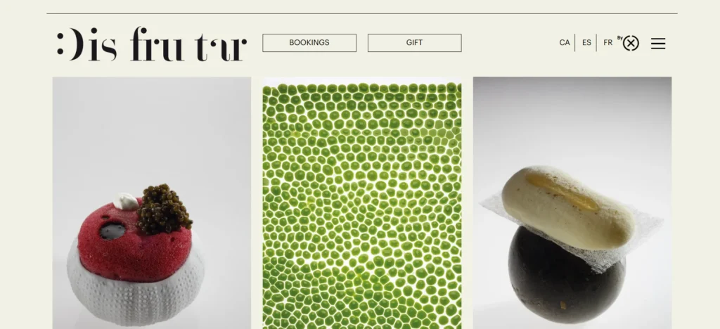
Disfrutar’s website thrives on visual energy. With a grid-based design that highlights bold dish photography and accolades, it instantly captures attention. Visitors can scroll through rotating visuals of dishes, reviews, and behind-the-scenes content. Their awards and global rankings are given prominence, building trust with new visitors.
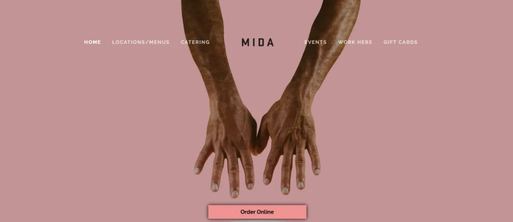
Mida is an Italian restaurant in Boston’s South End with amazing pasta dishes, a great wine list, and an ambiance that is, quite simply, cool. The website design matches this perfectly. The shadowy Millennial pink background, the sleek sans serif font, the intriguing photograph. The effect is cool and clickable, which is ideal for a restaurant looking to get reservations and online orders.
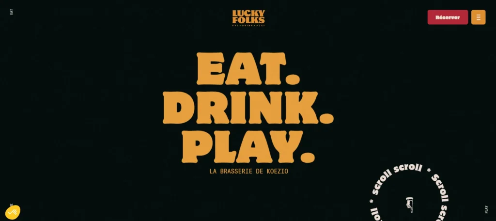
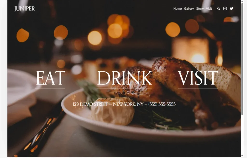
The black background of this website is quite attractive. The bold words, “eat, drink, play” are really cool and let users know what kind of vibe the restaurant is. Sliding down gets different background colors and different colored fonts. The whole vibes of the website are just so cool, makes you feel as if you’re eating with a friend.
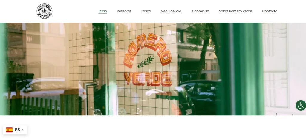
Romero Verde’s homepage is a hero photograph of its logo on the restaurant’s ceramic wall tile seen from the outside. The aesthetically captured image lets visitors have a quick look at the restaurant’s ambiance. Scroll down the homepage, and you’ll find some of Romero Verde’s food menu photos in a slideshow. It also has a dedicated section for its daily special meals, coupled with online ordering and booking functions.
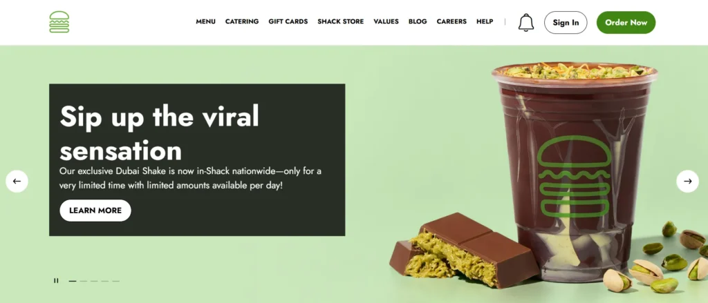
Shake Shack is a large fast-food chain with a young, modern feel. Its website color scheme is similar to Bennett’s: black and white with a bright, featured green. Shake Shack’s website also features its menu—which most searchers are looking for—right on its home page. The photos are detailed and show everything on the burgers and sandwiches, and right underneath each item has a full description, including all allergen information. This is great, but it isn’t just for large chains or franchises. Including this info is key for serving a ton of people effectively and safely, so make it easy for everyone with food restrictions to figure out which items on your menu work for them.
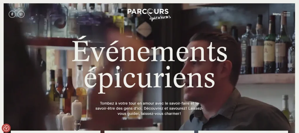
This website features videos of people enjoying food, which captivates and attracts users. The sliding feature provides a visually appealing model of the services, combining white and peach-red colors. The use of a simple color combination enhances the visual appeal of the website, making it more intriguing and exciting to view.
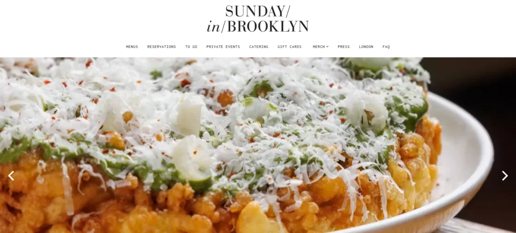
Brooklyn brunch spot Sunday in Brooklyn’s clean navigation bar makes it easy for customers to navigate to different parts of the website, while the high-quality images capture the eye.
This minimal layout gets a lot across as soon as someone lands on the homepage. Using a full-screen image of a dish or your space communicates the ambience of your restaurant or lets you highlight a menu item. From here, visitors can choose where to navigate based on their priorities: menu information, contact or address details, or reservation booking. The rest of the navigation gives you options to tie every part of your business together, linking to review sites and social media and background on how your business came to be.
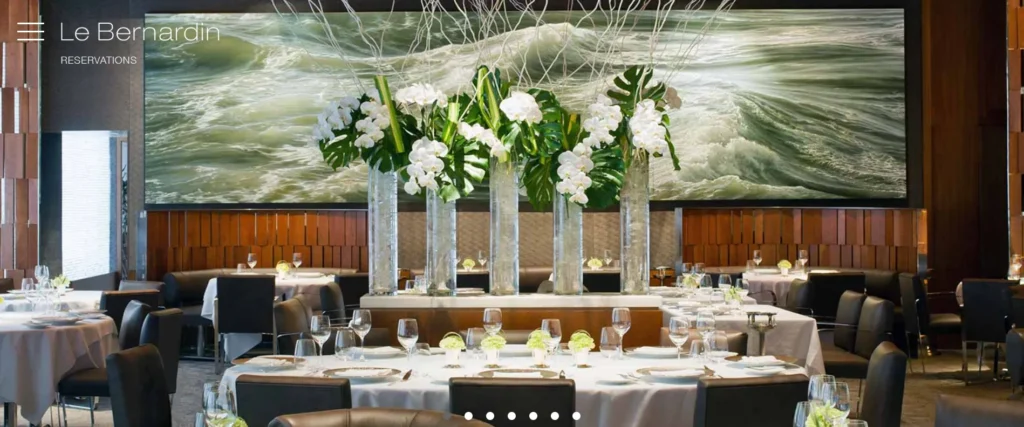
Le Bernardin is a restaurant in New York. They filled their website with amazing images which definitely show they’re exclusive. Scrolling down the website, you’ll find a personal note from the restaurant’s co-founder. The stunning image gives the website a more classy and elegant vibe. I love it!
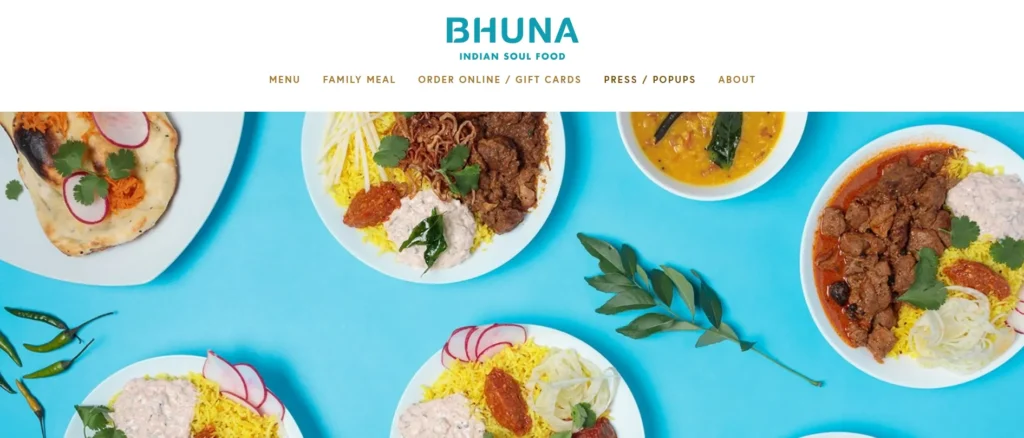
The best restaurant websites will make your stomach growl and Indian soulful spot Bhuna manages to do just that with high-quality images of its tasty dishes. The restaurant also makes great use of bright background colors that match its logo to create a unified color scheme.
6 Design Principles Every Restaurant Website Needs
After studying all ten examples, six design principles appear consistently across every successful restaurant website:
1. Food Photography Is Your Primary Conversion Tool
Visitors decide whether to book based on whether the food looks worth the price and the journey. Furthermore, professional food photography that accurately represents your actual dishes in good light consistently outperforms amateur photography regardless of every other design decision you make. Consequently, photography investment delivers higher ROI than any other design element on a restaurant website.
2. Reservation Access Must Require One Click
A visitor who cannot find the booking button within seconds will leave. Furthermore, the reservation or ordering link should appear in the main navigation, in the hero section of the homepage, and in the footer — accessible from every page without scrolling. Consequently, your conversion rate is directly proportional to how easy you make the primary action.
3. Never Use a PDF Menu
PDF menus are not readable on mobile without zooming, do not index in Google search, cannot be updated without re-uploading, and break the browsing experience. Furthermore, an HTML menu with current pricing and clear categories serves both the customer and your search visibility simultaneously. Consequently, every restaurant website should replace PDF menus with properly formatted web pages immediately.
4. Show the Room at Service — Not Empty
Empty dining room photography communicates studio quality. It does not communicate what it actually feels like to eat in your restaurant. Furthermore, photos of guests at tables, the bar during service, and the room at full energy sell the experience in a way that empty rooms never achieve. Consequently, always include atmosphere photography alongside food photography.
5. Mobile Performance Determines Reach
Most restaurant website visits happen on smartphones — people searching for dinner options, checking hours while walking, or sharing a link with friends. Furthermore, a website that loads slowly or displays incorrectly on mobile loses exactly the visitors who are most ready to book. Consequently, mobile speed and display quality are as commercially important as visual design.
6. Hours and Address Visible on Every Page
Restaurant hours, address, and transport information should appear in the footer of every page — visible without additional navigation. Furthermore, a visitor who finds your website through a Google search often wants only two pieces of information: are you open right now, and where exactly are you? Consequently, making this information require navigation costs you visitors who would otherwise have become customers.
How to Build Your Restaurant Website on WordPress
WordPress is an excellent foundation for restaurant websites of every size and type. Furthermore, the combination of design flexibility, plugin ecosystem, and SEO capability makes it the most practical choice for independent restaurants and small groups.
Essential WordPress tools for restaurant websites:
| Tool |
Purpose |
| Astra or Kadence Theme |
Fast, flexible foundation for building a restaurant website. |
| Elementor Pro |
Visual page design without coding. |
| Amelia or BookingPress |
Reservation and table booking management. |
| WPForms or Contact Form 7 (CF7) |
Contact and enquiry forms. |
| Rank Math SEO |
Local SEO, schema markup, and XML sitemaps. |
| WP Rocket |
Fast loading and performance optimization for image-heavy websites. |
| Wordfence |
Security and protection for customer data. |
Furthermore, WordPress gives you complete ownership of your website, your customer data, and your content — something subscription restaurant website builders cannot offer. Consequently, restaurants that build on WordPress invest in a permanent digital asset rather than paying monthly rent for access to someone else’s platform.
Conclusion
The 10 restaurant websites in this guide share one characteristic above everything else — they make the food and the dining experience look extraordinary before asking anything from the visitor.
Eleven Madison Park communicates exclusivity through restraint. Dishoom builds emotional connection through cultural depth. Shake Shack removes every barrier between hunger and order completion. Hawksmoor earns sophisticated diner trust through ingredient transparency. Tartine makes scarcity feel worth the effort.
Furthermore, each website succeeds not through expensive production but through clear priorities — the right photography, accessible booking, honest atmosphere communication, and fast mobile performance.
Therefore, apply these lessons to your own restaurant website in order of commercial impact. Start with photography. Fix the menu format. Make booking one click. Add your hours to every page. Consequently, each improvement directly increases the number of visitors who become diners — which is the only metric that ultimately matters.
Frequently Asked Questions (FAQs)