Here is something most website owners discover too late.
They spend weeks perfecting their website design on a desktop screen. Colors, fonts, spacing, layouts — everything looks exactly right. Then they open the same site on their smartphone and everything falls apart.
Text overlaps. Images stretch beyond the screen. Buttons become impossible to tap. The entire experience breaks. This is what happens when a website is not responsive. Furthermore, it is not just a design problem — it directly costs you visitors, leads, and search rankings.
Over 60% of all web traffic now comes from mobile devices. Moreover, Google uses mobile-first indexing, which means your mobile experience determines your search rankings — not your desktop design. Consequently, a website that fails on mobile fails everywhere that matters.
The good news? Elementor Pro makes building a fully responsive website achievable for anyone — without writing a single line of code.
In this guide, we walk through every step of creating a responsive website with Elementor Pro. Therefore, whether you are building a new site or fixing an existing one, this guide gives you a clear and practical path forward.
What Is Responsive Web Design?
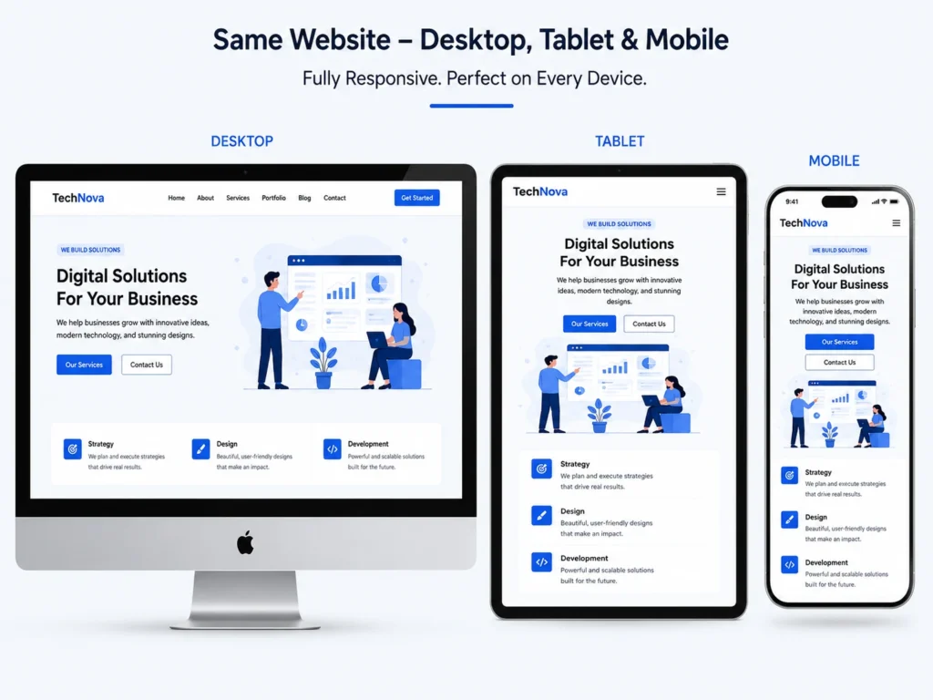
Responsive Web Design — often shortened to RWD — is an approach where a website automatically adjusts its layout, images, and content to fit any screen size.
A responsive website does not create separate pages for mobile and desktop. Instead, it uses flexible layouts and CSS rules that adapt to whatever device visits the page. Furthermore, the same URL delivers the right experience to every visitor — whether they arrive on a 27-inch monitor or a 5-inch smartphone screen.
Why This Matters More Than Ever
User Experience — Visitors who encounter a broken mobile layout leave immediately. Moreover, they rarely return. A responsive site keeps visitors engaged regardless of their device.
SEO Performance — Google evaluates your mobile experience first when determining where to rank your pages. Consequently, poor mobile design directly hurts your search visibility — even for desktop searches.
Future-Proofing — New screen sizes and devices emerge constantly. Furthermore, a properly responsive website adapts to devices that do not even exist yet without requiring redesigns.
Why Elementor Pro Is the Right Tool for Responsive Design
Many WordPress themes claim to be responsive out of the box. However, there is a significant difference between a theme that technically adjusts for mobile and a website that genuinely looks great and functions perfectly on every device.
Elementor Pro builds responsiveness into every element from the ground up. Furthermore, it gives you visual control over how each section, column, and widget appears on different screen sizes — without switching between code and preview constantly.
What Elementor Pro Offers for Responsive Design
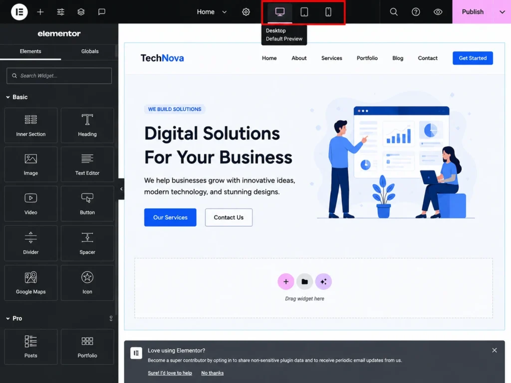
- Visual responsive mode — switch between desktop, tablet, and mobile views instantly
- Custom breakpoints — define exactly when your layout changes
- Per-device settings — control padding, font sizes, and visibility for each screen size separately
- Fluid units — use %, vh, vw, em, and rem instead of fixed pixels
- Responsive-ready template kits — professionally designed starting points
- Hide/show elements per device — show content tailored to each screen size
1: Start with a Mobile-First Mindset
The single most important shift in responsive design thinking is this — design for mobile first, then expand for larger screens.
Most beginners do the opposite. They build a beautiful desktop layout and then try to shrink it down for mobile. Furthermore, this approach consistently creates problems because desktop designs contain too many elements, too much visual complexity, and too little flexibility for small screens.
Why Mobile-First Works Better
Mobile-first forces you to prioritize. When your canvas is 375 pixels wide, every element must earn its place. Consequently, your most important content and calls to action become prominent. Everything secondary gets removed or moved lower.
Moreover, expanding a clean mobile layout for desktop is significantly easier than compressing a complex desktop layout for mobile. Therefore, starting small produces better results at every screen size.
How to Apply Mobile-First in Elementor Pro
- Open Elementor editor on your page
- Click the responsive mode icon at the bottom of the editor panel
- Select Mobile view
- Design your layout for mobile screens first
- Switch to Tablet and adjust
- Switch to Desktop and finalize
Elementor Pro shows exactly how your page looks at each breakpoint in real time. Furthermore, any changes you make in mobile view apply only to mobile — desktop settings stay untouched. Consequently, you design each device experience independently without one breaking the other.
2: Use Elementor's Responsive-Ready Template Kits
Building a responsive website from a blank canvas takes significantly longer than starting from a well-designed template. Elementor Pro’s template kit library offers hundreds of professionally designed, fully responsive starting points.
What Template Kits Include
Each kit provides a complete set of coordinated page templates — homepage, about page, services, contact, and more. Furthermore, every template is already optimized for mobile, tablet, and desktop without requiring any additional configuration.
How to Use a Template Kit
- In the Elementor editor, click the folder icon to open the template library
- Browse kits by industry or style
- Preview the kit on different screen sizes before importing
- Click Insert to apply the template to your page
- Replace placeholder content with your actual text and images
Moreover, template kits give you a reliable responsive foundation. Consequently, you spend your design time customizing for your brand rather than solving layout problems from scratch.
3: Understand and Configure Breakpoints
Breakpoints define the screen widths where your website layout changes. Furthermore, they are the technical foundation of every responsive design decision you make.
Elementor Pro comes with three default breakpoints:
| Breakpoint | Default Width | Typical Devices |
|---|
| Desktop | 1025px and above | Laptops, Desktop Monitors, Large Screens |
| Tablet | 768px – 1024px | iPads, Android Tablets, Large Tablets |
| Mobile | Below 768px | Smartphones, Small Mobile Devices |
Custom Breakpoints in Elementor Pro
Elementor Pro allows you to add custom breakpoints beyond the three defaults. This matters because device screen sizes vary widely — a 1280px laptop and a 1600px wide monitor may need different layouts.
To add custom breakpoints:
- Go to Site Settings in Elementor
- Click Layout in the left sidebar
- Open the Breakpoints section
- Add additional breakpoints as needed — widescreen, tablet landscape, or mobile landscape
Furthermore, custom breakpoints give you precise control over exactly when your layout adapts. Consequently, visitors on every device type see a layout designed specifically for their screen rather than a compromise.
4: Use Fluid Units Instead of Fixed Pixels
One of the most common responsive design mistakes is using fixed pixel values for widths, font sizes, and spacing. Pixels do not scale — they stay fixed regardless of screen size. Consequently, a 600px wide image looks fine on desktop but overflows on a 375px mobile screen.
Elementor Pro supports multiple unit types that scale with the screen:
% (Percentage)
Sets width relative to the parent container. A section set to 90% width always leaves 5% space on each side — on any screen size. Furthermore, this creates natural breathing room without manual adjustment per device.
vw (Viewport Width)
Sets size relative to the total screen width. 100vw always fills the full screen width. Moreover, this works perfectly for full-width hero sections and background elements.
vh (Viewport Height)
Sets size relative to the total screen height. 100vh creates a section that fills the entire visible screen. Consequently, hero sections that fill the screen on any device become straightforward to build.
em and rem (Relative Font Units)
Sets font size relative to the parent element (em) or root element (rem). Furthermore, these units scale proportionally — when a user increases their browser font size for accessibility, your text scales with it.
Practical Application in Elementor Pro
- Set container widths to percentages rather than fixed pixels
- Use vw units for typography that scales with screen width
- Apply rem units to font sizes for accessibility compliance
- Set padding and margins using em or percentage values
5: Control Each Device Independently
Elementor Pro allows every widget setting to be configured separately for each device. This capability is what separates truly responsive websites from ones that just technically scale down.
Per-Device Settings You Can Control
Typography Heading font sizes that work on desktop often feel overwhelming on mobile. Furthermore, body text that reads comfortably on a large screen may appear too small on a phone. Set separate font sizes for desktop, tablet, and mobile in every typography setting.
Padding and Spacing Generous section padding looks elegant on desktop. However, that same padding wastes precious vertical space on mobile. Consequently, reducing padding for mobile keeps content visible without excessive scrolling.
Column Layout Elementor allows you to change column structures per device. A three-column layout on desktop can automatically become a single-column stack on mobile. Furthermore, you control the stacking order — deciding which column appears first on small screens.
Element Visibility Some design elements serve desktop users but create clutter on mobile. Elementor Pro’s hide/show per device setting lets you display different content for different audiences. Moreover, decorative elements that add visual interest on large screens can be hidden on mobile to keep the experience clean and fast.
6: Optimize Images for Every Screen Size
Images are the heaviest elements on most web pages. Furthermore, loading a 2000px wide desktop image on a 375px mobile screen wastes bandwidth, slows loading times, and hurts Core Web Vitals scores.
Image Best Practices in Elementor Pro
Use the Image Size Setting Elementor lets you set different image sizes for different devices. Furthermore, serving smaller image files to mobile visitors reduces load time significantly without any visible quality difference.
Enable Lazy Loading Lazy loading delays image loading until a visitor scrolls toward them. Consequently, the initial page load becomes faster — especially important for mobile users on slower connections.
Compress Before Uploading Always compress images before uploading to WordPress. Furthermore, tools like TinyPNG, Squoosh, or ShortPixel reduce file sizes by 50-80% without visible quality loss. Consequently, every visitor benefits from faster loading regardless of their device.
Use WebP Format WebP images are significantly smaller than JPEG or PNG at equivalent quality. Moreover, Elementor supports WebP natively. Therefore, converting your images to WebP before uploading delivers measurable performance improvements.
7: Test Your Responsive Design Properly
Testing responsive design only in Elementor’s preview mode is not enough. The editor preview approximates how your site looks — but real devices behave differently.
Testing Method 1: Elementor Responsive Preview
Elementor’s built-in responsive mode gives you instant feedback while designing. Switch between desktop, tablet, and mobile using the icons at the bottom of the editor. Furthermore, drag the preview width to check layouts at sizes between your defined breakpoints.
Testing Method 2: Chrome DevTools
Right-click on any page in Chrome and select Inspect. Furthermore, click the device toolbar icon to switch to responsive mode. Then choose from preset device sizes — iPhone, iPad, Samsung Galaxy — or enter custom dimensions.
This method shows how real browsers render your pages on specific devices. Moreover, it reveals layout issues that the Elementor preview sometimes misses.
Testing Method 3: Real Devices
Test on actual smartphones and tablets whenever possible. Furthermore, ask someone with a different device type to test your site and describe what they experience. Consequently, you catch issues that no simulator accurately reproduces — touch target sizes, scroll behavior, and font rendering differences all vary between real devices.
What to Check During Testing
- Text remains readable without zooming on all screens
- Buttons and links are easy to tap on mobile (minimum 44px touch target)
- Images display correctly without stretching or cropping
- Navigation menus work on touch screens
- Forms are usable on mobile keyboards
- Pages load in under 3 seconds on a mobile connection
8: Common Responsive Design Mistakes to Avoid
Even with Elementor Pro’s powerful tools, certain mistakes consistently trip up website builders. Furthermore, knowing them in advance saves hours of debugging after launch.
Mistake 1: Relying Only on Desktop Preview
Designing exclusively in desktop view and checking mobile only at the end creates problems that require significant rework. Furthermore, catching mobile issues early — during design, not after — saves time. Therefore, switch to mobile view regularly throughout your design process.
Mistake 2: Using Fixed Pixel Widths Everywhere
Fixed pixel values break on screens that do not match your expected width. Furthermore, fluid units like percentages and viewport units adapt automatically. Consequently, replacing pixels with fluid units in your container widths prevents most overflow and alignment issues.
Mistake 3: Ignoring Touch Target Sizes
Desktop users click precise points with a mouse cursor. Mobile users tap with fingers that cover 40-60px of screen area. Furthermore, buttons, links, and navigation items that are too small become frustrating to use. Consequently, ensure all interactive elements meet the minimum 44x44px recommended touch target size.
Mistake 4: Keeping the Same Font Size Across Devices
A 48px hero heading looks impressive on desktop. On mobile, that same size may push other content off screen. Furthermore, most body text set at 16px on desktop needs no change — but headings consistently need adjustment. Therefore, always set separate heading sizes for mobile in Elementor’s typography settings.
Mistake 5: Not Testing on Real Devices
Browser simulations are useful starting points. However, they do not perfectly replicate real device behavior. Moreover, a layout that looks perfect in DevTools sometimes breaks on an actual smartphone. Consequently, always test on at least two or three real devices before considering a site complete.
9: Make Your Responsive Site Fast and SEO-Ready
A responsive layout is the foundation. Performance and SEO complete the picture.
Google measures your site’s mobile performance through Core Web Vitals. Furthermore, slow-loading pages rank lower regardless of how well-designed the responsive layout is. Consequently, pairing strong responsive design with performance optimization delivers the best possible search visibility.
Essential Performance Steps for Responsive WordPress Sites
Install a Caching Plugin — W3 Total Cache or WP Rocket serve pre-built page versions to visitors, reducing server processing time significantly.
Use a CDN — A Content Delivery Network serves your website files from servers closest to each visitor. Furthermore, CDN delivery reduces page load times for visitors in different geographic locations.
Optimize Your Hosting — Quality WordPress hosting with SSD storage and server-level caching makes every other performance optimization more effective. Moreover, poor hosting undermines all other speed improvements.
Configure Rank Math or Yoast SEO — Ensure your responsive pages have proper meta titles, descriptions, and schema markup set. Furthermore, these SEO settings apply across all device versions of your pages automatically.
Conclusion
Creating a fully responsive website with Elementor Pro is not about memorizing complex CSS rules or studying browser compatibility charts.
It is about following a clear process — mobile-first thinking, smart use of breakpoints, fluid units, per-device settings, optimized images, and thorough testing. Furthermore, Elementor Pro provides the visual tools to apply every one of these principles without touching code.
The websites that perform best in search results and convert visitors most effectively share one characteristic — they look and work great on every device their visitors use. Moreover, with Elementor Pro, achieving that standard is genuinely within reach for any website builder at any skill level.
Therefore, start with your mobile layout. Add your breakpoints. Use fluid units throughout. Test on real devices. Launch with confidence.
Your visitors are on every device imaginable. Meet them where they are.
Frequently Asked Questions (FAQs)