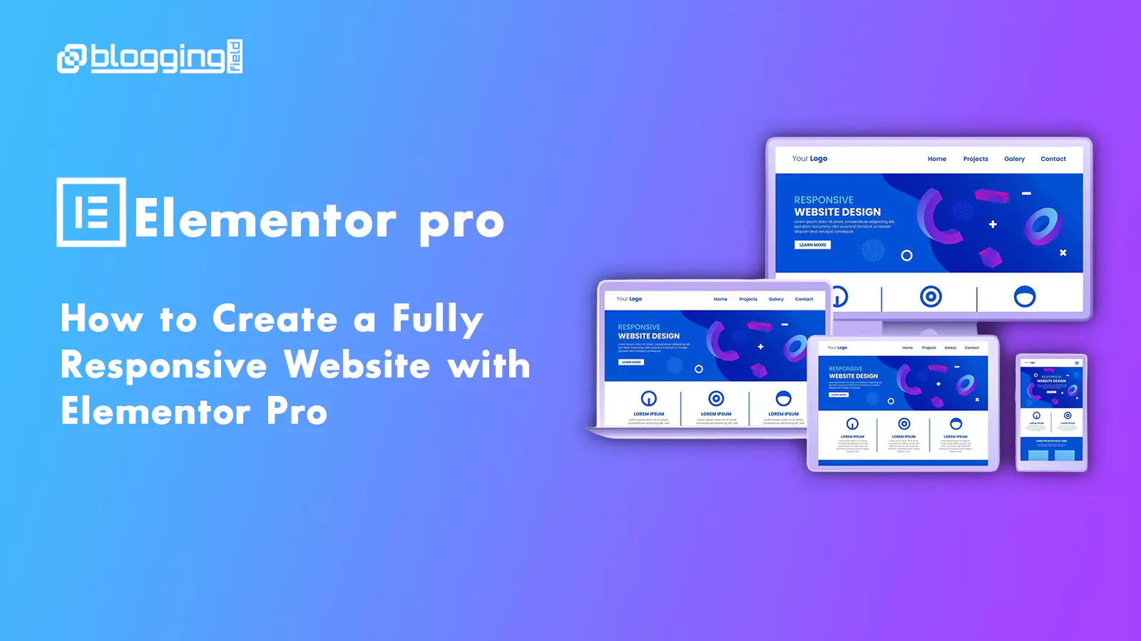
How to Create a Fully Responsive Website with Elementor Pro
Here is something most website owners discover too late. They spend weeks perfecting their website design on a desktop screen. Colors, fonts, spacing, layouts — everything looks exactly right. Then they open the same site on their smartphone and everything falls apart. Text overlaps. Images stretch beyond the screen. Buttons