A brilliant course means nothing if visitors leave before they scroll past the homepage.
Furthermore, studies show that 94% of first impressions are based purely on design. A learner who lands on a cluttered, confusing education website forms a negative judgment before reading a single lesson description — and that judgment is nearly impossible to reverse.
The stakes have never been higher. Online education revenue is projected to reach $203.81 billion, growing steadily as competition among eLearning platforms intensifies. Furthermore, offering excellent course content alone no longer guarantees success — the website itself must engage visitors, build trust, and guide them smoothly from curiosity to enrollment.
In this guide, we break down 10 of the best education websites and the specific design principles each one demonstrates. Furthermore, whether you run a university portal, a course marketplace, or a solo tutoring business, these examples give you a clear, applicable direction.
What Makes an Education Website Actually Work?
Before exploring the examples, understand the five factors that separate high-converting education websites from generic course listing pages:
| Factor | What It Means |
|---|
| Clear Navigation | Visitors find relevant courses within seconds, not minutes. |
| Accessibility | Screen reader support, captions, and adjustable settings for all learners. |
| Trust Signals | Reviews, instructor credentials, and completion certificates. |
| Interactivity | Previews, quizzes, or embedded tools that let visitors try before committing. |
| Mobile Responsiveness | Full functionality on smartphones, where much course browsing happens. |
10 Best Education Websites
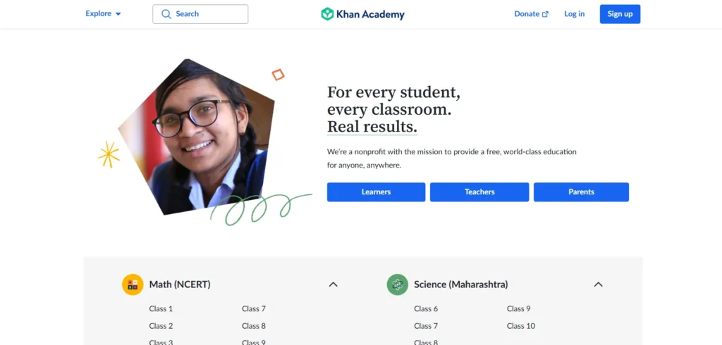
Website: khanacademy.org Category: Free K-12 and beyond education Primary Lesson: True accessibility features — not just compliance checkboxes — expand who a platform can genuinely serve
Khan Academy’s ultra-clean interface strips away unnecessary visual clutter, placing full focus on educational content and easy navigation. Furthermore, a welcoming image of a child on the landing page fosters a relatable atmosphere appropriate for its young audience.
The platform’s commitment to accessibility goes remarkably deep. Furthermore, keyboard navigation, screen reader compatibility, and adjusted color contrast enhance usability for visually impaired users. Moreover, a “reduce motion” feature caters to those sensitive to animations, while transcripts and subtitles support learners who are deaf or hard of hearing. Consequently, Khan Academy demonstrates that accessibility is not a checkbox exercise — it genuinely expands who a platform can serve.
Key Design Lessons:
✅ Screen reader compatibility and keyboard navigation should be built in, not bolted on
✅ “Reduce motion” options serve visitors sensitive to animation genuinely well
✅ Transcripts and subtitles extend accessibility to deaf and hard-of-hearing learners
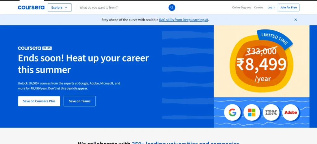
Website: coursera.org Category: University-partnered course marketplace Primary Lesson: Strong visual hierarchy moves visitors from discovery to enrollment without unnecessary friction
Coursera’s design is clean, professional, and genuinely intuitive. Furthermore, the homepage uses a minimalist layout with clear navigation, making it easy to explore courses, degrees, and career paths without feeling lost in options.
Every key action — searching, filtering, enrolling — sits exactly where visitors expect it, minimizing the learning curve for first-time users. Moreover, eye-tracking research shows Coursera’s visual hierarchy strongly draws attention toward course recommendations and side menus, guiding users to high-value content early in their visit. Consequently, the platform balances aesthetics with functionality to create an efficient learning experience for millions of users worldwide.
Key Design Lessons:
✅ Consistent typography and generous white space improve readability significantly
✅ Personalized recommendations reduce the friction of browsing large catalogs
✅ Visual hierarchy should draw attention to the highest-value actions first
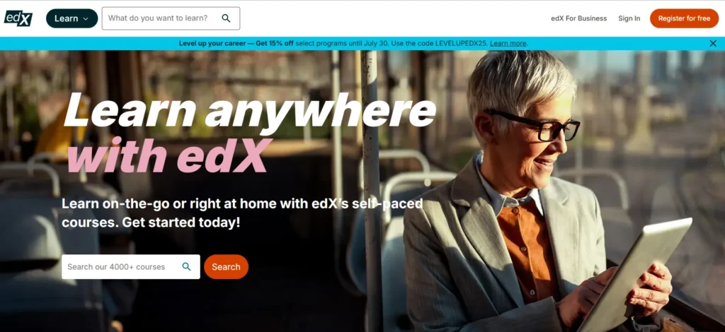
Website: edx.org Category: Professional certificates and university programs Primary Lesson: Interactive previews let visitors evaluate fit before committing, reducing enrollment hesitation
edX stands out through effective calls-to-action that guide users seamlessly toward course enrollment. Furthermore, well-structured typography and a consistent grid-based layout help visitors navigate efficiently through edX’s vast catalog of professional certificates, degrees, and short programs.
Hover-triggered course previews, collapsible content sections, and dynamic filtering options make browsing feel active and responsive rather than static. Moreover, this preview system allows visitors to evaluate course relevance and structure before committing, supporting more confident enrollment decisions. Consequently, edX demonstrates that interactivity itself can function as a conversion tool.
Key Design Lessons:
✅ Hover-triggered previews let visitors sample content without leaving the browsing flow
✅ Collapsible sections manage information density without overwhelming the page
✅ Grid-based layouts support efficient navigation through large course catalogs
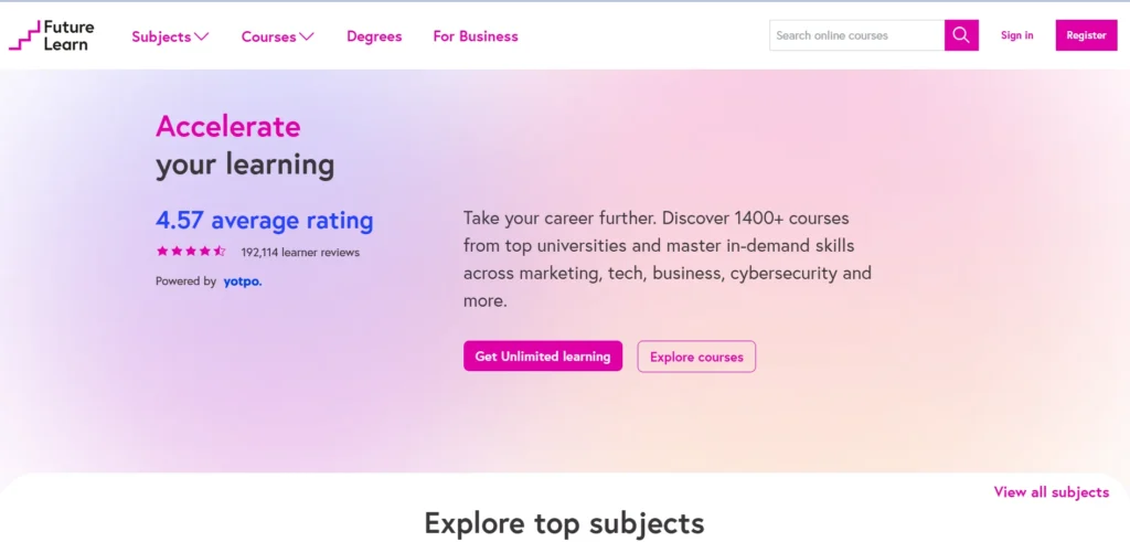
FutureLearn’s minimalist UI and immersive learning paths make it a top pick in 2025. The platform focuses on collaborative learning, integrating social interaction tools like discussions and forums within each course. Its crisp typography, rich media support, and progress tracking enhance user engagement.
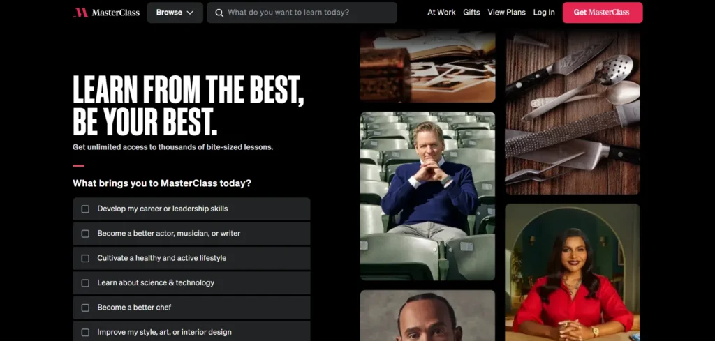
Website: masterclass.com Category: Premium celebrity-taught courses Primary Lesson: Production quality itself communicates the premium positioning a high-price course needs to justify
MasterClass captivates visitors with genuinely cinematic presentation, effectively showcasing its premium courses. Furthermore, the homepage features a dynamic, full-screen video montage of renowned instructors, immediately engaging visitors and highlighting the platform’s unique offerings.
Its visual storytelling mirrors the experience of browsing a high-end streaming platform, blending educational content with Netflix-level production quality. Moreover, a minimalist navigation bar ensures intuitive browsing, while high-contrast typography enhances readability against the dark background. Consequently, MasterClass proves that for premium-priced education, the website’s production values must match the price point being asked.
Key Design Lessons:
✅ Premium-priced courses need premium-quality visual presentation to justify their cost
✅ Dark backgrounds with high-contrast typography create a distinctive, memorable brand feel
✅ Full-screen video immediately communicates positioning before any text is read
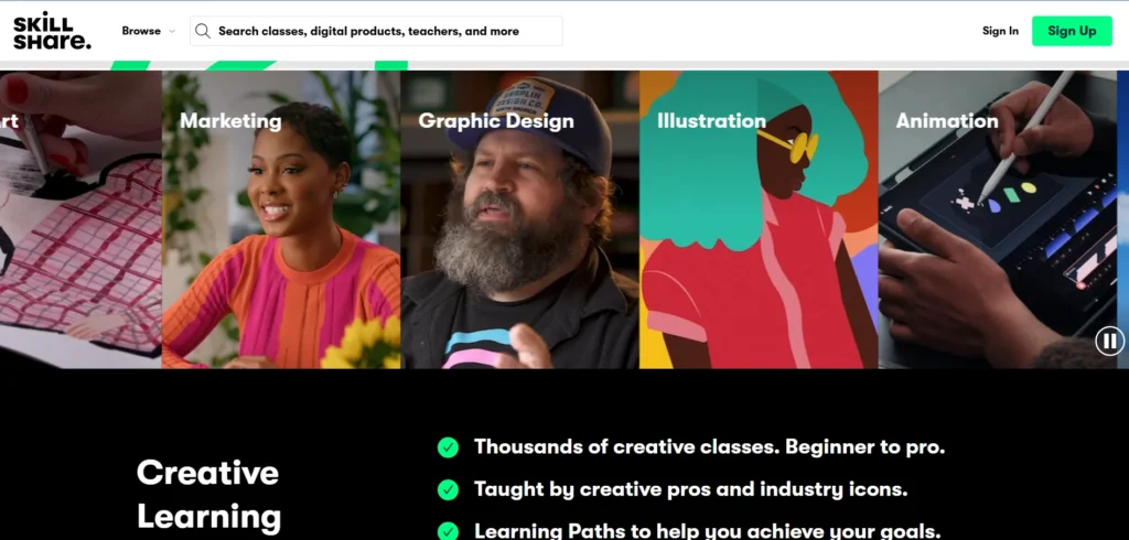
Website: skillshare.com Category: Creative skills marketplace Primary Lesson: Visual style should match audience identity — vibrant design suits creative learners specifically
Skillshare employs a vibrant and dynamic visual style that directly reflects its creative audience. Furthermore, bold, colorful imagery and engaging animations communicate the platform’s focus on creativity and innovation from the very first screen.
Despite this visually rich interface, the layout remains uncluttered, allowing visitors to explore categories and trending classes without cognitive overload. Moreover, an intuitive navigation system lets users seamlessly browse diverse class categories while personalized recommendations enhance engagement. Consequently, Skillshare proves that visual energy and usability discipline can coexist when balanced deliberately.
Key Design Lessons:
✅ Visual style should reflect and validate your specific target audience’s identity
✅ Bold color and animation can coexist with uncluttered, easy navigation
✅ Personalized recommendations increase engagement even within visually rich interfaces
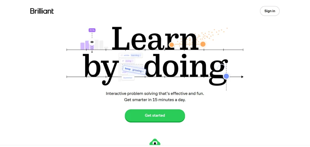
Brilliant.org impresses with its interactive, problem-solving approach to STEM education. The platform’s vibrant illustrations, visual math tools, and quiz-driven lessons make abstract topics easier to grasp. The gamification of lessons encourages curiosity and consistent engagement from users of all ages.
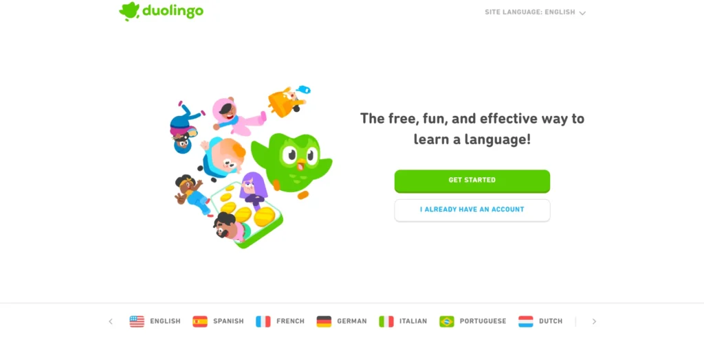
Duolingo’s blend of bite-sized language lessons and playful gamification keeps users hooked in 2025. The platform’s character animations, progress levels, and streak system provide continuous motivation. The recent upgrade introduces conversational AI partners, helping users practice languages in realistic contexts.
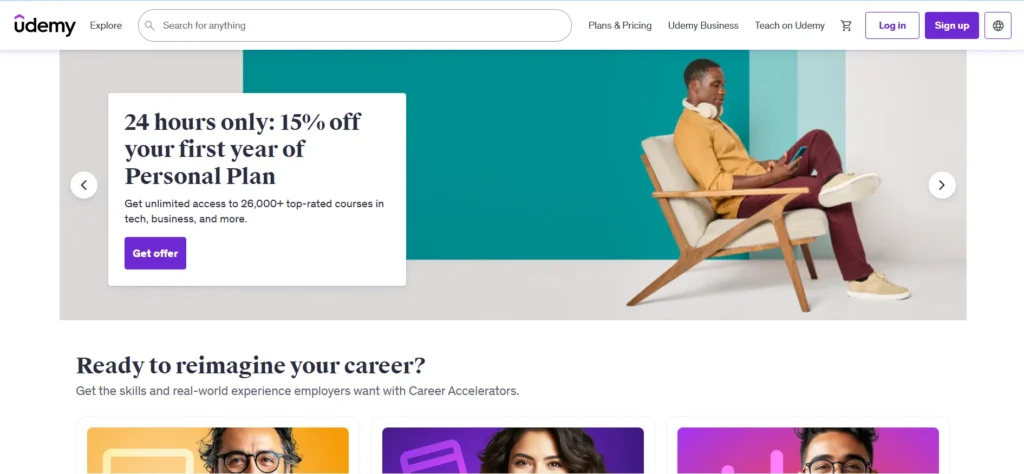
Website: udemy.com Category: Open marketplace course platform Primary Lesson: Well-structured filtering keeps massive catalogs navigable rather than overwhelming
Udemy centers its homepage around a prominent search bar and dynamic category-based navigation, helping visitors sift through over 200,000 courses efficiently. Furthermore, filters by level, price, rating, and duration streamline discovery without overwhelming first-time users.
Bold typography and contrasting brand colors — dark gray and purple — apply consistently across buttons, banners, and navigation, reinforcing Udemy’s identity throughout the browsing journey. Moreover, the course preview function lets visitors watch a sample before enrolling, enhancing decision-making and reducing dropout rates significantly. Consequently, Udemy proves that scale and usability are not mutually exclusive when filtering is genuinely well-designed.
Key Design Lessons:
✅ Multi-dimensional filtering (level, price, rating, duration) makes massive catalogs feel manageable
✅ Course preview functionality reduces uncertainty before purchase commitment
✅ Consistent brand color application across all UI elements builds recognition
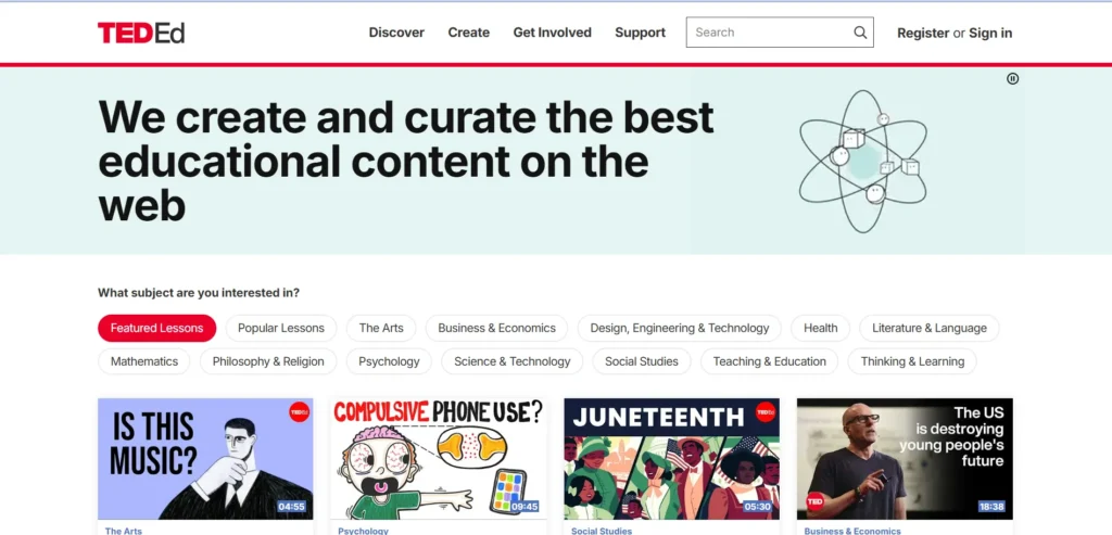
TED-Ed offers visually rich, story-driven educational content in 2025. The platform is known for animated lessons that simplify complex topics for students and teachers alike. Its lesson builder tool allows educators to customize content, while the new design improves video interaction and community learning.
5 Design Principles Every Education Website Needs
1. Navigation Must Scale With Catalog Complexity
Udemy and Coursera both prove that even massive catalogs remain navigable with the right filtering and category structure. Furthermore, a visitor who cannot find their subject or skill level quickly leaves regardless of how strong the actual content is. Consequently, navigation investment should scale directly with the size of your course library.
2. Accessibility Expands Your Genuine Audience
Khan Academy demonstrates that accessibility features — screen reader support, reduced motion options, and transcripts — genuinely expand who a platform can serve rather than simply satisfying compliance requirements. Furthermore, accessible design also tends to improve usability for every visitor, not just those with specific needs.
3. Interactivity Builds Enrollment Confidence
edX and Codecademy both show that letting visitors sample content — through previews or embedded tools — before committing significantly reduces enrollment hesitation. Furthermore, this “try before you buy” approach respects visitor uncertainty rather than demanding blind trust.
4. Design Tone Should Match Audience and Price Point
Skillshare’s vibrant creativity suits its audience precisely. MasterClass’s cinematic polish justifies its premium pricing. Furthermore, an education website’s visual tone should always align deliberately with both who it serves and what it charges — mismatched tone creates subtle friction that visitors feel even if they cannot articulate why.
5. Mobile Performance Determines Real-World Reach
Much course browsing and even course completion now happens on smartphones. Furthermore, an education website that performs poorly on mobile loses exactly the busy, time-pressed learners most motivated to fit education into small pockets of free time.
Building an Education Website on WordPress
WordPress provides a genuinely strong foundation for education websites of every size — from a solo tutor’s course to a full institutional learning platform.
Essential WordPress tools for education websites:
- LMS Plugin: LearnDash, LifterLMS, or Tutor LMS for course structure and student progress tracking
- Theme: Astra or Kadence — lightweight foundations that support content-heavy layouts
- Page Builder: Elementor Pro — visual design control for landing and course pages
- Performance: WP Rocket — essential for video-heavy course content
- SEO: Rank Math — helps course and lesson pages rank for relevant search terms
Moreover, WordPress ownership means your course content, student data, and enrollment records remain permanently yours — an important advantage over subscription-based course platforms that limit customization and charge ongoing transaction fees.
Conclusion
The ten education websites in this guide succeed because they understand something fundamental — every friction point between arrival and enrollment costs real students.
Furthermore, every one of these approaches is achievable regardless of your platform’s size or budget — the underlying principles of clear navigation, accessibility, trust-building, and interactivity apply whether you offer three courses or three thousand.
Therefore, study which of these ten approaches aligns most closely with your specific audience and content. Consequently, your education website becomes more than a course catalog — it becomes the confident first step in every student’s learning journey.
Frequently Asked Questions (FAQs)