You have built something real. A welcoming studio. A thoughtful schedule. A teaching style that genuinely helps people.
But if your website does not communicate any of that within the first five seconds of a visitor’s arrival, they leave — and book with a competitor whose studio might not even be as good as yours.
This is the quiet problem most yoga studio owners face. Furthermore, they invest deeply in the physical experience they create and minimally in the digital first impression that determines whether new clients ever walk through the door.
Your yoga website is not a nice-to-have marketing tool. It is the foundation of your new client acquisition. Moreover, a well-designed yoga website works around the clock — answering questions, showcasing your teaching style, enabling class bookings, and converting curious visitors into paying students. Consequently, every hour you invest in building it properly pays back in consistently filled classes.
In this guide, we cover everything you need to design a yoga website that genuinely attracts new clients — from the essential pages and design principles to scheduling integration and common mistakes to avoid.
Before You Start Building: 4 Things to Prepare First
A polished website instantly builds trust with potential students. Unlike social media profiles that come and go, a dedicated website shows you’re serious about your practice. Display your certifications, training background, and teaching philosophy to showcase expertise. Professional photos of your studio or classes create an inviting atmosphere that social media alone can’t match.
1. Professional Photography
Visitor opinions about your studio form within seconds of landing on your homepage. Furthermore, those opinions are based primarily on visual quality — specifically, the quality of your photography.
Hire a professional photographer to capture your studio space, your classes in session, and if possible, short video clips of your teaching. Moreover, authentic images of real students in your actual space communicate warmth and credibility that stock photography never achieves. Consequently, this single investment delivers more website impact than any design decision you make afterward.
2. Your Website Copy
Write your headlines, service descriptions, about section, and class descriptions before building. Furthermore, designing a website around finished copy produces far better results than designing first and fitting words in afterward.
Focus on what students care about — how your classes make them feel, what results they can expect, who your teaching is designed for, and what makes your studio different from the yoga class at the gym around the corner. Consequently, copy written around student benefits converts significantly better than copy written around class names and instructor credentials alone.
3. Your Visual Brand
Decide on your color palette, typography, and overall visual tone before building. Furthermore, these choices should reflect your studio’s personality — earthy and grounded, clean and modern, warm and welcoming, or energetic and dynamic.
Consistent visual branding across every page of your website creates professionalism that builds visitor confidence. Moreover, inconsistent fonts, colors, and imagery styles signal a lack of attention to detail — which is not the impression any yoga studio wants to create. Consequently, settling your visual identity before building saves significant redesign time later.
4. Your Primary Actions
Decide exactly what you want website visitors to do. Furthermore, every page should guide visitors toward one or two specific actions — book a trial class, view the schedule, or contact the studio.
Your primary action is most likely booking an introductory offer. Consequently, every page on your website should make that action easy to find and compelling to take.
6 Pages Every Yoga Studio Website Must Have
Page 1: Homepage
Your homepage has one job — give visitors a clear, compelling reason to stay and explore further. Furthermore, it should answer three questions within five seconds: What is this place? Who is it for? What should I do next?
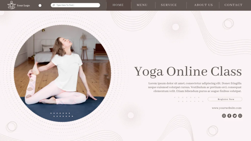
A strong yoga studio homepage includes a professional hero image or video, a clear headline that communicates your studio’s positioning, your location for local SEO, an introductory offer call to action, and social proof — a testimonial or class count that establishes credibility immediately. Moreover, the navigation should guide visitors naturally toward the pages they most likely want to visit next.
Page 2: Class Schedule
Your class schedule page is likely the most visited page on your entire website after the homepage. Furthermore, it must be easy to read, updated consistently, and connected directly to your booking system.
Display your schedule in a clear weekly or monthly view with class names, times, teacher names, level indicators, and direct booking links beside each entry. Moreover, filtering by class type or day helps visitors with specific scheduling needs find relevant options quickly. Consequently, a well-designed schedule page converts schedule browsers into class bookers without requiring them to contact you.
Page 3: Pricing and Memberships
Many potential students hesitate to contact studios because they are uncertain whether pricing fits their budget. Furthermore, displaying pricing transparently removes this barrier and pre-qualifies the inquiries you receive.
List your class packages, memberships, drop-in rates, and introductory offers clearly. Moreover, explain the value of each option rather than simply listing prices. Consequently, transparent pricing reduces the friction between interest and booking — and attracts students who have already decided they can afford your classes before contacting you.
Page 4: About the Studio and Teachers
Yoga students choose teachers as much as they choose studios. Furthermore, a detailed about page that shares your teaching philosophy, training background, certifications, and personal story creates the personal connection that converts visitors into students.
Include professional headshots of every instructor alongside their specializations and teaching styles. Moreover, authentic bio content that reveals personality performs better than credentials-only descriptions. Consequently, students who feel they understand and connect with your teachers before their first class arrive with significantly lower anxiety than those who know nothing about who will be teaching them.
Page 5: New Student Landing Page
Create a dedicated page for visitors who have never attended your studio. Furthermore, this page answers the specific questions and concerns first-timers have — what to wear, what to bring, what level the class is appropriate for, where to park, and what to expect.
An introductory offer prominently featured on this page — a discounted first class, a two-week trial, or a free first session — gives hesitant visitors a low-risk way to experience your studio. Consequently, a well-designed new student page dramatically increases conversion rates from first-time website visitors.
Page 6: Contact Page
Your contact page should make reaching you as easy as possible through multiple channels. Furthermore, include your address with an embedded Google Map, phone number, email address, studio hours, and a simple contact form.
Responding promptly to contact form submissions matters as much as the design of the page itself. Moreover, a contact form that receives no response within 24 hours loses the inquiry entirely. Consequently, set up email notifications for every form submission so leads never go cold without your knowledge.
8 Key Design Elements for a Great Yoga Website
1. Authentic Photography Over Stock Images
Nothing undermines yoga website credibility faster than generic stock photography of models in perfect poses against white backgrounds. Furthermore, visitors recognize stock images immediately — and they signal that the studio does not have enough confidence in their actual space and students to show them.
Use real photos of your studio, your classes, and your community. Moreover, a professional photographer can capture authentic moments in a single session that serve your website for years. Consequently, authentic photography creates the warmth and trust that stock images never achieve regardless of their technical quality.
2. Calming Color Palette
Color psychology matters significantly in wellness website design. Furthermore, colors communicate mood before visitors read a single word of your content.
Earthy tones — terracotta, sage, warm beige, deep forest green — communicate grounding and nature connection. Clean whites and soft neutrals signal clarity and minimalism. Moreover, warm coral and blush palettes create welcoming, feminine energy. Consequently, your color palette should reflect the specific emotional experience your yoga practice creates — and feel consistent across every page without exception.
3. Readable Typography
Yoga is a practice of clarity and ease. Furthermore, your typography should reflect those same qualities — clean, readable fonts with generous line spacing and appropriate contrast between text and background.
Avoid decorative script fonts for body text — they reduce readability significantly on mobile screens. Moreover, serif or clean sans-serif fonts in appropriate sizes (minimum 16px for body text) ensure comfortable reading across all devices. Consequently, readable typography keeps visitors engaged with your content longer rather than straining their eyes and leaving.
4. Mobile-First Design
A majority of your potential students will discover your website on a smartphone. Furthermore, they will book classes on their phone, check the schedule on their phone, and share your website link from their phone.
Every design decision you make should work perfectly on a 375px mobile screen first. Moreover, images should load quickly on cellular connections, buttons should be large enough to tap comfortably, and your booking system must function without desktop-specific features. Consequently, a mobile-optimized yoga website captures the majority of your potential audience rather than frustrating them away.
5. Fast Loading Speed
A yoga website that takes more than three seconds to load loses a significant percentage of visitors before they experience anything about your studio. Furthermore, large unoptimized images — particularly photography-heavy yoga websites — are the most common cause of slow loading.
Compress every image before uploading. Install a caching plugin. Choose quality hosting with fast server response times. Moreover, test your loading speed on a real smartphone rather than only on your fast home WiFi connection. Consequently, students browsing your website on a cellular connection get the same fast experience as those on broadband.
6. Clear Calls to Action
Every page on your yoga website should guide visitors toward a specific next step. Furthermore, that next step should be obvious — a button that stands out visually, text that tells visitors exactly what to do, and placement that catches the eye without requiring scrolling.
Your primary CTA is almost certainly your introductory offer. Moreover, this offer should appear on your homepage above the fold, on your class schedule page, on your pricing page, and in your website footer. Consequently, visitors who become interested at any point in their browsing experience always find an obvious path to taking action.
7. Student Testimonials and Reviews
New students choosing a yoga studio for the first time experience genuine anxiety — will I fit in? Will the teacher judge me? Will I be the least flexible person there? Furthermore, testimonials from real students address these anxieties directly and authentically.
Feature testimonials prominently on your homepage and new student page. Moreover, include the student’s name, photo if they are willing, and specific details about their experience rather than generic praise. Consequently, relatable testimonials from real people in your community convert hesitant visitors into first-time students far more effectively than any design element you can add.
8. Online Booking Integration
A beautiful website that requires students to email or call to book a class loses a significant percentage of potential bookings. Furthermore, in wellness and fitness, the decision to book often happens in the moment — and any friction between decision and booking allows doubt to creep back in.
Integrate your scheduling software directly into your website so students can see availability and book their spot within the same browsing session. Consequently, impulse bookings — which represent a significant portion of new student acquisition — convert rather than evaporating before the student finds time to call.
SEO for Yoga Studios — Getting Found Locally
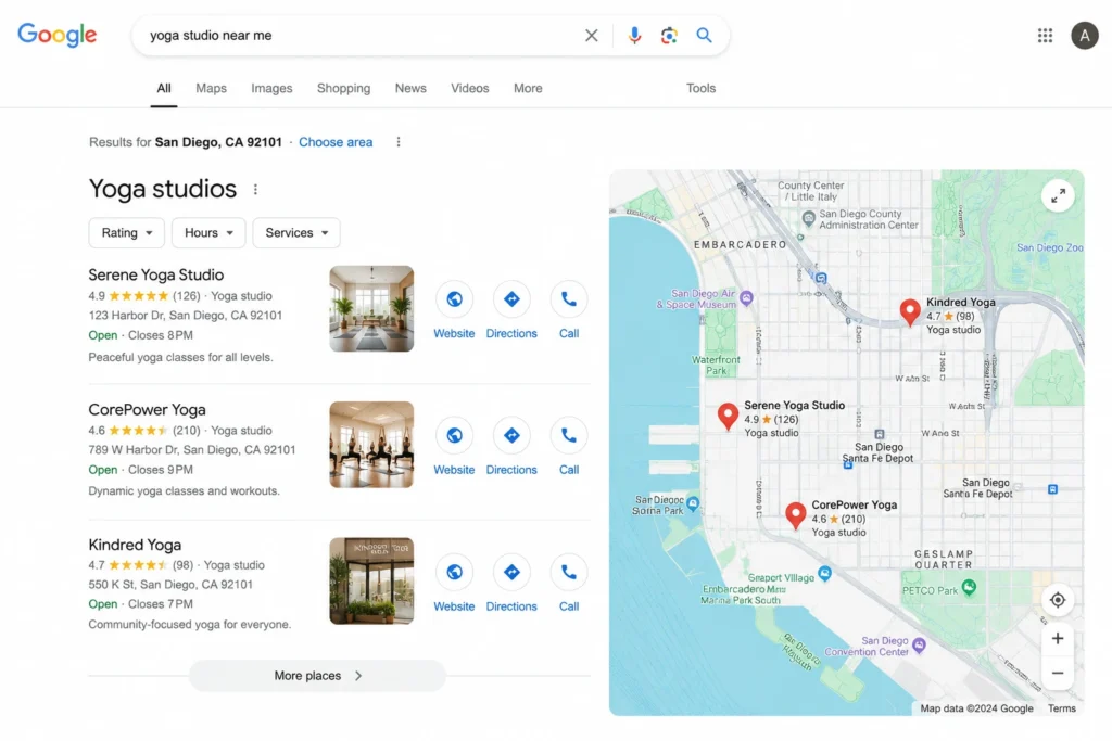
A beautifully designed yoga website that nobody finds through search delivers no new clients. Furthermore, local SEO for yoga studios focuses on ranking for searches like “yoga studio near me” and “yoga classes in [your city]” — the queries your potential students actually use.
Essential Local SEO Steps
Claim and optimize your Google Business Profile. This is the single most impactful local SEO action you can take. Furthermore, a complete Google Business Profile with accurate hours, photos, and regular posts helps you appear in the local map pack — the three studios shown prominently in local searches before organic results.
Create location-specific page content. Include your city and neighbourhood naturally throughout your homepage, about page, and contact page. Moreover, a blog covering local wellness topics, community events, and neighbourhood guides builds local content authority over time.
Install an SEO plugin. Rank Math or Yoast SEO handles meta titles, descriptions, local business schema markup, and sitemap generation for your entire website. Furthermore, local schema markup specifically helps Google understand and display your studio’s name, address, phone number, and hours in search results. Consequently, properly configured local SEO drives a consistent flow of new student inquiries from organic search.
4 Common Yoga Website Mistakes to Avoid
Mistake 1: Visual Clutter
More content does not mean more value. Furthermore, cluttered homepages with too many sections, competing calls to action, and excessive text overwhelm visitors rather than engaging them. Consequently, remove anything that does not directly serve your primary goals and let quality content breathe with generous whitespace.
Mistake 2: Inconsistent Visuals
Mixing photography styles, using too many font variations, and applying color inconsistently across pages signals unprofessionalism. Furthermore, visitors notice visual inconsistency even when they cannot articulate why the website feels off. Consequently, establish clear visual standards and apply them without exception throughout every page.
Mistake 3: No Clear Introductory Offer
Visitors arriving at a yoga website for the first time need a low-risk first step. Furthermore, a website that only shows full membership prices without a trial offer loses the majority of first-time visitors who are interested but not yet ready to commit. Consequently, always feature an introductory offer — a discounted first class, a free trial, or a two-week unlimited pass — prominently on your homepage.
Mistake 4: Outdated Schedule or Pricing
Nothing erodes trust faster than a class schedule showing sessions from months ago or pricing that does not match what students pay when they arrive. Furthermore, maintaining website content accuracy requires a consistent update habit — block fifteen minutes weekly to review and update time-sensitive information. Consequently, students who trust your website enough to book never arrive to discover information that does not match reality.
Building Your Yoga Website on WordPress
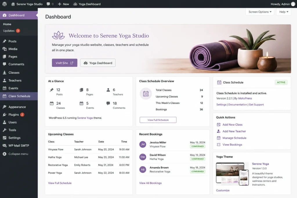
WordPress is an excellent choice for yoga studio websites. Furthermore, it provides the design flexibility, plugin ecosystem, and SEO capability that studios of all sizes need.
Essential WordPress tools for yoga studios:
- Theme: Astra or Kadence — lightweight, fast, and highly customizable
- Page Builder: Elementor Pro — visual design without coding
- Booking Integration: Amelia or Simply Schedule Appointments
- SEO: Rank Math — local schema, meta tags, sitemaps
- Performance: WP Rocket — fast loading for image-heavy sites
- Security: Wordfence — protect student contact data
- SSL: Free through your hosting provider
Moreover, WordPress ownership means your website, your student email list, and all your content belongs to you completely — not to a subscription platform that can change pricing or terms at any time. Consequently, yoga studios that build on WordPress invest in a permanent digital asset rather than renting space on someone else’s platform.
Conclusion
A well-designed yoga website with authentic photography, clear scheduling, transparent pricing, a compelling introductory offer, and strong local SEO works as your most consistent new client acquisition tool — quietly filling classes while you focus on teaching.
Furthermore, the investment you make in getting these fundamentals right pays back through consistently growing student numbers, lower dependence on paid advertising, and a professional digital presence that reflects the quality of the experience you create in the studio.
Therefore, start with your photography and copy. Build your six essential pages. Integrate your scheduling software. Optimize for local search. Consequently, your yoga website becomes the foundation of sustainable studio growth rather than an afterthought you mean to improve someday.
Frequently Asked Questions (FAQs)